Toolbar
概述
Toolbar 是 WordPress 组件库中的一个组件,用于分组相关选项,特别是图标按钮,以增强用户界面的组织性和交互性。它遵循设计指南,支持多种状态和开发配置。
关键要点
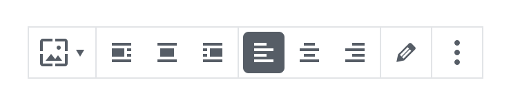
- Toolbar 用于分组相关选项,强调图标按钮的关联性,应共享一个公共容器。
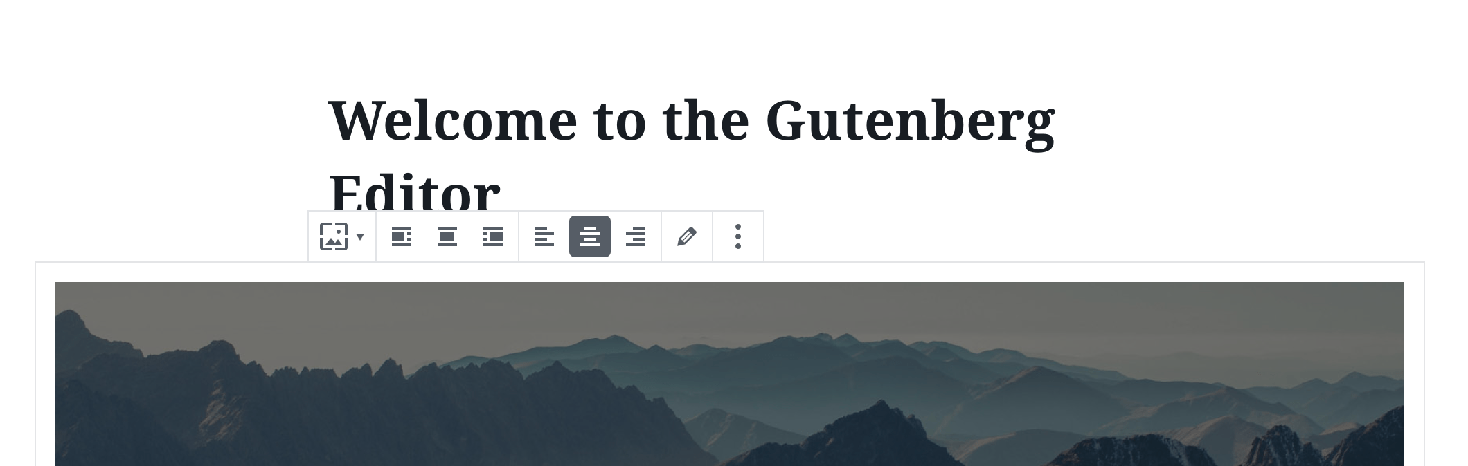
- 设计指南包括:明确指示点击触发动作、适当使用颜色(如红色仅用于难撤销操作)、在块上方或界面中保持位置一致。
- 状态包括:活动/可用状态(通过悬停和焦点表达选项)、禁用状态(可禁用或隐藏)。
- 开发中通过 @wordpress/components 导入 Toolbar 和 ToolbarButton,支持自定义 props 如 className、label、variant 和 orientation。
- 相关组件包括 ToolbarGroup、ToolbarButton 和 ToolbarItem,可作为 Toolbar 的子元素。
代码示例
import { Toolbar, ToolbarButton } from '@wordpress/components';
import { formatBold, formatItalic, link } from '@wordpress/icons';

function MyToolbar() {
    return (
        <Toolbar label="Options">
            <ToolbarButton icon={ formatBold } label="Bold" />
            <ToolbarButton icon={ formatItalic } label="Italic" />
            <ToolbarButton icon={ link } label="Link" />
        </Toolbar>
    );
}
注意事项
- Toolbar 的 label prop 是必需的,用于提供无障碍标签。
- variant prop 可选 'unstyled' 以移除边框,但保留默认弹出样式;orientation prop 默认为 'horizontal',可选 'vertical' 以改变键盘交互方向。
Toolbar can be used to group related options. To emphasize groups of related icon buttons, a toolbar should share a common container.
Design guidelines
Usage
Best practices
Toolbars should:
- Clearly communicate that clicking or tapping will trigger an action.
- Use established colors appropriately. For example, only use red for actions that are difficult or impossible to undo.
- When used with a block, have a consistent location above the block. Otherwise, have a consistent location in the interface.
States
Active and available toolbars
A toolbar’s state makes it clear which icon button is active. Hover and focus states express the available selection options for icon buttons in a toolbar.
Disabled toolbars
Toolbars that cannot be selected can either be given a disabled state, or be hidden.
Development guidelines
Usage
import { Toolbar, ToolbarButton } from '@wordpress/components';
import { formatBold, formatItalic, link } from '@wordpress/icons';

function MyToolbar() {
    return (
        <Toolbar label="Options">
            <ToolbarButton icon={ formatBold } label="Bold" />
            <ToolbarButton icon={ formatItalic } label="Italic" />
            <ToolbarButton icon={ link } label="Link" />
        </Toolbar>
    );
}
Props
Toolbar will pass all HTML props to the underlying element. Additionally, you can pass the custom props specified below.
className: string
Class to set on the container div.
- Required: No
label: string
An accessible label for the toolbar.
- Required: Yes
variant: 'unstyled' | undefined
Specifies the toolbar’s style.
Leave undefined for the default style. Or 'unstyled' which removes the border from the toolbar, but keeps the default popover style.
- Required: No
- Default:
undefined
orientation: 'horizontal' | 'vertical'
Specifies the toolbar’s orientation.
Leave undefined or ‘horizontal’ for horizontal orientation keyboard interactions, choose ‘vertical’ for the alternative.
- Required: No
- Default:
horizontal
Related components
- Toolbar may contain ToolbarGroup, ToolbarButton and ToolbarItem as children.