Panel
概述
Panel 是 WordPress 组件库中的一个可折叠内容区域组件,用于垂直展开和收缩多个内容部分,以优化用户界面和体验。
关键要点
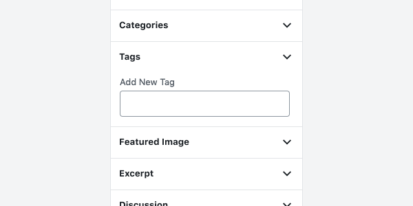
- Panel 用于显示和隐藏列表项的详细信息,通过垂直展开和收缩内容来帮助用户仅查看所需内容。
- 设计指南建议使用 caret 图标表示可折叠状态,重要内容应默认展开,并位于顶部。
- 开发时使用 Panel、PanelBody 和 PanelRow 等子组件构建界面,支持自定义标题、图标、初始状态和回调函数。
- Panel 适用于需要概览多个相关部分或隐藏低优先级信息的场景,但关键信息或快速切换时建议使用替代组件如 Tabs。
代码示例
import { Panel, PanelBody, PanelRow } from '@wordpress/components';
import { more } from '@wordpress/icons';

const MyPanel = () => (
    <Panel header="My Panel">
        <PanelBody title="My Block Settings" icon={ more } initialOpen={ true }>
            <PanelRow>My Panel Inputs and Labels</PanelRow>
        </PanelBody>
    </Panel>
);
注意事项
- PanelBody 的 children 属性可以是 React.ReactNode 或函数,函数接收包含 opened 属性的对象作为参数。
- PanelRow 是一个 flex 容器,用于在 PanelBody 内提供间距,并支持转发 ref 到包装 div。
- PanelHeader 通常由 Panel 组件内部使用,一般无需直接调用。
Panels expand and collapse multiple sections of content.
Design guidelines
Anatomy
A Panel is a single section of content that can be expanded or collapsed as needed.
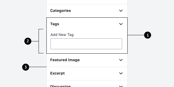
- Panel
- Body
- Divider
Usage
Panels show and hide details of list items by expanding and collapsing list content vertically. Panels help users see only the content they need.
When to use Panels
Use Panels when it’s helpful to:
- See an overview of multiple, related sections of content.
- Show and hide those sections as needed.
- Hide information that is lower priority that users don’t need to see all the time.
- View more than one section at a time.
Consider an alternative component when:
- There’s crucial information or error messages that require immediate action.
- You need to quickly switch between only a few sections (consider using Tabs instead).
Behavior
Expand and collapse
Show and hide details of existing panel items by expanding and collapsing list content vertically.
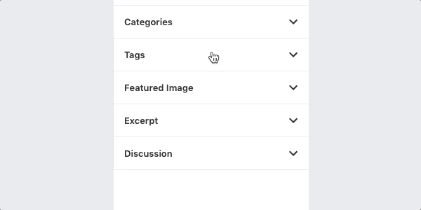
Collapsible panels are indicated with a caret icon that is flipped when expanded. Carets are preferable over a plus or arrow icon, because a plus indicates addition, and arrows are closely related to navigation.
Panels should be expanded by default if the content is important or essential. Panels that are open by default should appear at the top.
Development guidelines
The Panel creates a container with a header that can take collapsible PanelBody components to easily create a user friendly interface for affecting state and attributes.
Usage
import { Panel, PanelBody, PanelRow } from '@wordpress/components';
import { more } from '@wordpress/icons';

const MyPanel = () => (
    <Panel header="My Panel">
        <PanelBody title="My Block Settings" icon={ more } initialOpen={ true }>
            <PanelRow>My Panel Inputs and Labels</PanelRow>
        </PanelBody>
    </Panel>
);
Sub-Components
Panel
Props
header: string
The text that will be rendered as the title of the panel. Text will be rendered inside an
<h2> tag.
- Required: No
className: string
The CSS class to apply to the wrapper element.
- Required: No
children: React.ReactNode
The content to display within the panel row.
- Required: Yes
PanelBody
The PanelBody creates a collapsible container that can be toggled open or closed.
Props
title: string
Title text. It shows even when the component is closed.
- Required: No
opened: boolean
When set to true, the component will remain open regardless of the initialOpen prop and the
panel will be prevented from being closed.
- Required: No
className: string
The CSS class to apply to the wrapper element.
- Required: No
icon: React.JSX.Element
An icon to be shown next to the title.
- Required: No
onToggle: ( next: boolean ) => void;
A function that is called any time the component is toggled from its closed state to its
opened state, or vice versa.
- Required: No
- Default:
noop
initialOpen: boolean
Whether or not the panel will start open.
- Required: No
- Default:
true
children: | React.ReactNode | ( ( props: { opened: boolean } ) => React.ReactNode )
The content to display in the PanelBody. If a function is provided for this prop, it will receive an object with the opened prop as an argument.
- Required: No
buttonProps: WordPressComponentProps<Omit< ButtonAsButtonProps, 'icon' >, 'button', false>
Props that are passed to the Button component in title within the PanelBody.
- Required: No
- Default:
{}
scrollAfterOpen: boolean
Scrolls the content into view when visible. This improves the UX when multiple PanelBody
components are stacked in a scrollable container.
- Required: No
- Default:
true
PanelRow
PanelRow is a generic container for rows within a PanelBody. It is a flex container with a top margin for spacing.
Props
className: string
The CSS class to apply to the wrapper element.
- Required: No
children: React.ReactNode
The content to display within the panel row.
- Required: No
Ref
PanelRow accepts a forwarded ref that will be added to the wrapper div. Usage:
<PanelRow className="edit-post-post-schedule" ref={ panelRowRef }>
PanelHeader
PanelHeader renders the header for the Panel. This is used by the Panel component under the hood, so it does not typically need to be used.
Props
label: string
The text that will be rendered as the title of the Panel. Will be rendered in an <h2> tag.
- Required: No
children: React.ReactNode
The content to display within the panel row.
- Required: No
Related components
- To divide related sections of content accessed by a horizontal menu, use
TabPanel