区块设计
概述
本文档提供了设计新区块的最佳实践,包括界面布局、交互原则和示例说明,旨在帮助开发者创建直观易用的区块。
关键要点
- 区块内容区域是主要界面,用于直接操作和内容编辑,包括占位符指导和选中后控件。
- 区块工具栏作为次要界面,用于关键功能选项,需基于图标设计并按逻辑分组控件。
- 设置侧边栏仅用于高级或三级控件,不应依赖其进行基本操作,并建议使用分段和标题组织选项。
- 设置状态与实时预览状态:根据默认内容可用性和用户输入需求决定是否使用设置状态,以灰色背景区分。
- 区块命名应简短直接,描述需清晰简洁,图标应独特且单色,避免与现有区块重复。
- 考虑移动设备兼容性和深色背景编辑器方案,确保区块在不同环境下正常工作。
注意事项
- 避免在选中区块时大幅改变其大小和显示,以免造成用户困扰。
- 不要将区块基本操作控件放在侧边栏,否则移动用户或关闭侧边栏的用户可能无法使用。
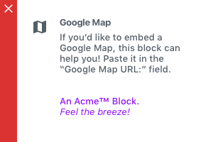
- 避免使用长或多行的区块名称和描述,以及品牌化内容。
- 尽量减少模态框的使用,优先直接交互。
代码示例
// 添加区块描述示例
registerBlockType('example/block', {
    description: '创建项目符号或编号列表。',
    // 其他属性...
});The following are best practices for designing a new block, with recommendations and detailed descriptions of existing blocks to illustrate our approach to creating blocks.
Best Practices
The primary interface for a block is the content area of the block
Since the block itself represents what will actually appear on the site, interaction here hews closest to the principle of direct manipulation and will be most intuitive to the user. This should be thought of as the primary interface for adding and manipulating content and adjusting how it is displayed. There are two ways of interacting here:
- The placeholder content in the content area of the block can be thought of as a guide or interface for users to follow a set of instructions or “fill in the blanks”. For example, a block that embeds content from a 3rd-party service might contain controls for signing in to that service in the placeholder.
- After the user has added content, selecting the block can reveal additional controls to adjust or edit that content. For example, a signup block might reveal a control for hiding/showing subscriber count. However, this should be done in minimal ways, so as to avoid dramatically changing the size and display of a block when a user selects it (this could be disorienting or annoying).
The Block Toolbar is a secondary place for required options & controls
Basic block settings won’t always make sense in the context of the placeholder/content UI. As a secondary option, options that are critical to the functionality of a block can live in the block toolbar. The Block Toolbar is still highly contextual and visible on all screen sizes. One notable constraint with the Block Toolbar is that it is icon-based UI, so any controls that live in the Block Toolbar need to be ones that can effectively be communicated via an icon or icon group.
Group Block Toolbar controls with related items
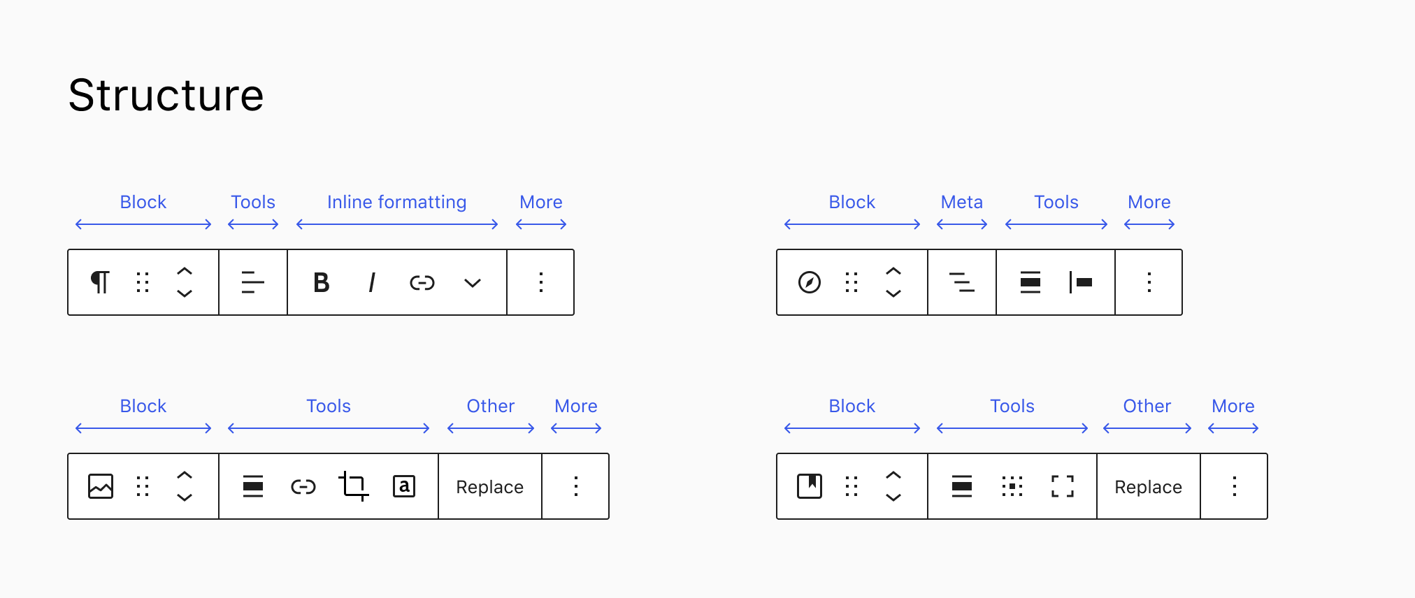
The Block Toolbar groups controls in segments, hierarchically. The first segment contains block type controls, such as the block switcher, the drag handle, and the mover control. The second group contains common and specific block tools that affect the entire block, followed by inline formatting, and the “More” menu. Optionally “Meta” or “Other” groups can separate some tools in their own segment.
The Settings Sidebar should only be used for advanced, tertiary controls
The Settings Sidebar is not visible by default on a small / mobile screen, and may also be collapsed in a desktop view. Therefore, it should not be relied on for anything that is necessary for the basic operation of the block. Pick good defaults, make important actions available in the block toolbar, and think of the Settings Sidebar as something that most users should not need to open.
In addition, use sections and headers in the Settings Sidebar if there are more than a handful of options, in order to allow users to easily scan and understand the options available.
Each Settings Sidebar comes with an “Advanced” section by default. This area houses an “Additional CSS Class” field, and should be used to house other power user controls.
Setup state vs. live preview state
Setup states, sometimes referred to as “placeholders”, can be used to walk users through an initial process before showing the live preview state of the block. The setup process gathers information from the user that is needed to render the block. A block’s setup state is indicated with a grey background to provide clear differentiation for the user. Not all blocks have setup states — for example, the Paragraph block.
A setup state is not necessary if:
- You can provide good default content in the block that will meet most people’s needs.
- That default content is easy to edit and customize.
Use a setup state if:
- There isn’t a clear default state that would work for most users.
- You need to gather input from the user that doesn’t have a 1-1 relationship with the live preview of the block (for example, if you need the user to input an API key to render content).
- You need more information from the user in order to render useful default content.
For blocks that do have setup states, once the user has gone through the setup process, the placeholder is replaced with the live preview state of that block.

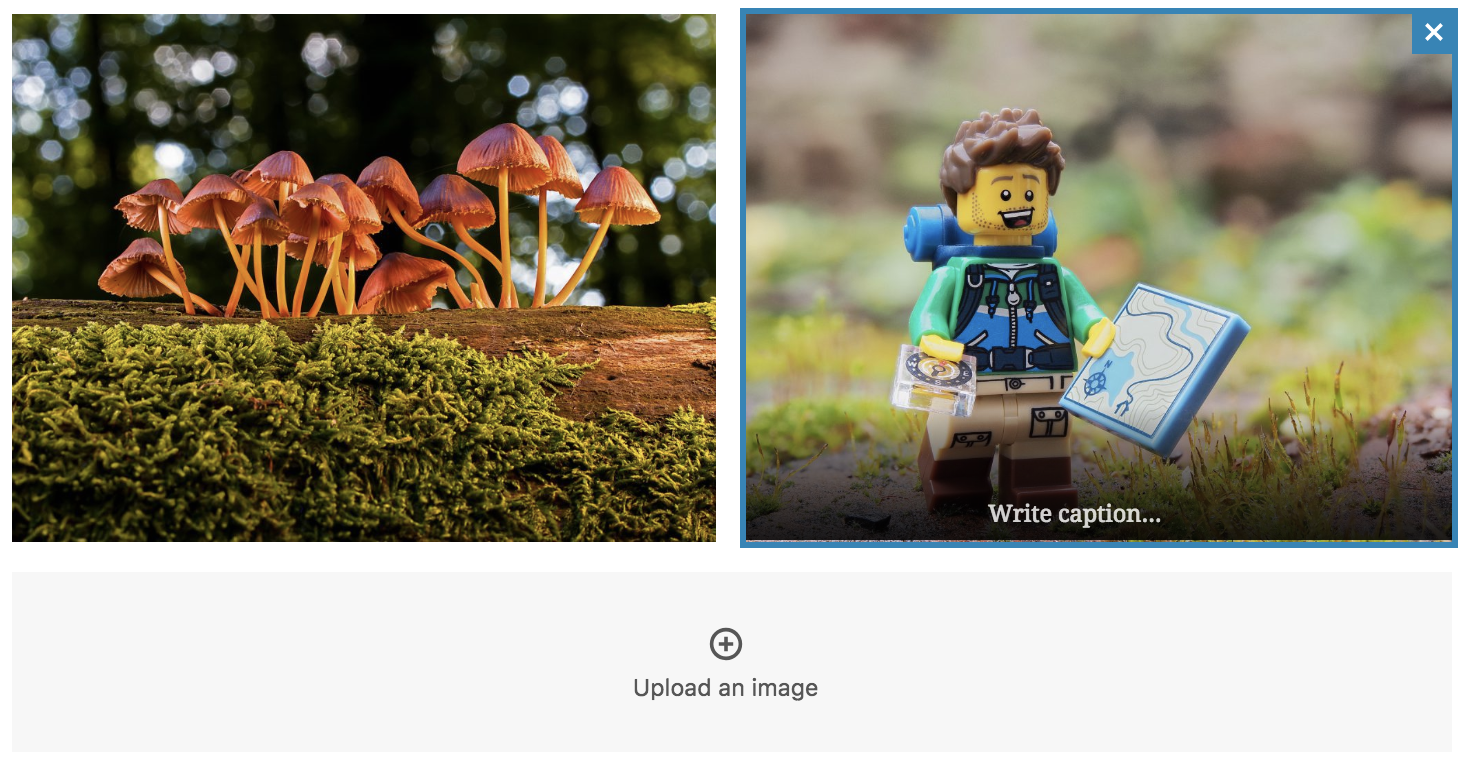
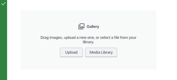
When the block is selected, additional controls may be revealed to customize the block’s contents. For example, when the image gallery is selected, it reveals controls to remove or add images.
In most cases, a block’s setup state is only shown once and then further customization is done via the live preview state. However, in some cases it might be desirable to allow the user to return to the setup state — for example, if all the block content has been deleted or via a link from the block’s toolbar or sidebar.
Do’s and Don’ts
Block Toolbar
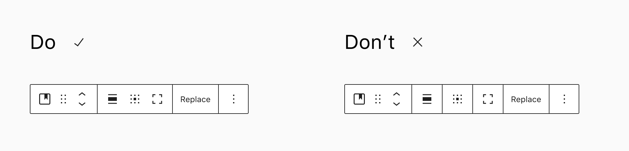
Group toolbar controls in logical segments. Don’t add a segment for each.
Block identification
A block should have a straightforward, short name so users can easily find it in the block library. A block named “YouTube” is easy to find and understand. The same block, named “Embedded Video (YouTube)”, would be less clear and harder to find in the block library.
When referring to a block in documentation or UI, use title case for the block title and lowercase for the “block” descriptor. For example:
- Paragraph block
- Latest Posts block
- Media & Text block
Blocks should have an identifying icon, ideally using a single color. Try to avoid using the same icon used by an existing block. The core block icons are based on Material Design Icons. Look to that icon set, or to Dashicons for style inspiration.
Do:
Use concise block names.
Don’t:
Avoid long, multi-line block names.
Block description
Every block should include a description that clearly explains the block’s function. The description will display in the Settings Sidebar.
You can add a description by using the description attribute in the registerBlockType function.
Stick to a single imperative sentence with an action + subject format. Examples:
- Start with the basic building block of all narrative.
- Introduce new sections and organize content to help visitors (and search engines) understand the structure of your content.
- Create a bulleted or numbered list.
Do:
Use a short, simple block description.
Don’t:
Avoid long descriptions and branding.
Placeholders
If your block requires a user to configure some options before you can display it, you should provide an instructive placeholder state.
Do:
Provide an instructive placeholder state.
Don’t:
Avoid branding and relying on the title alone to convey instructions.
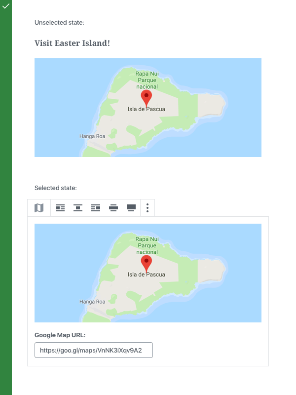
Selected and unselected states
When unselected, your block should preview its content as closely to the front-end output as possible.
When selected, your block may surface additional options like input fields or buttons to configure the block directly, especially when they are necessary for basic operation.
Do:
For controls that are essential for the operation of the block, provide them directly inside the block edit view.
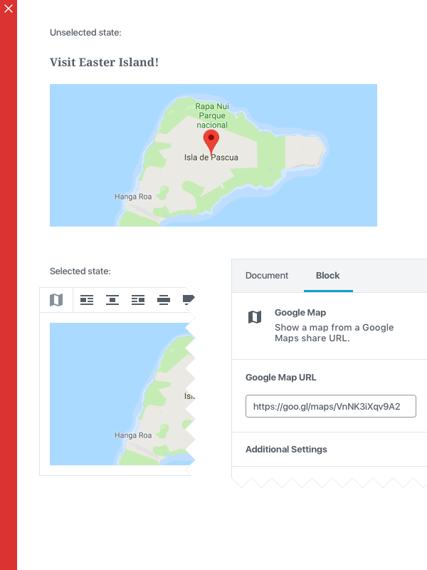
Don’t:
Do not put controls that are essential to the block in the sidebar, otherwise the block will appear non-functional to mobile users or desktop users who have dismissed the sidebar.
Advanced block settings
The “Block” tab of the Settings Sidebar can contain additional block options and configuration. Keep in mind that a user can dismiss the sidebar and never use it. You should not put critical options in the Sidebar.
Do:
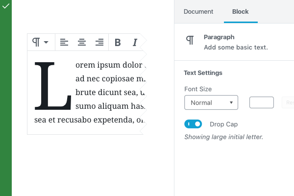
Because the Drop Cap feature is not necessary for the basic operation of the block, you can put it to the Block tab as optional configuration.
Consider mobile
Check how your block looks, feels, and works on as many devices and screen sizes as you can.
Support Gutenberg’s dark background editor scheme
Check how your block looks with dark backgrounds in the editor.
Examples
To demonstrate some of these practices, here are a few annotated examples of default Gutenberg blocks:
Paragraph
The most basic unit of the editor. The Paragraph block is a simple input field.
Placeholder
- Simple placeholder text that reads “Type / to choose a block”. The placeholder disappears when the block is selected.
Selected state
- Block Toolbar: Has a switcher to perform transformations to headings, etc.
- Block Toolbar: Has basic text alignments
- Block Toolbar: Has inline formatting options, bold, italic, strikethrough, and link
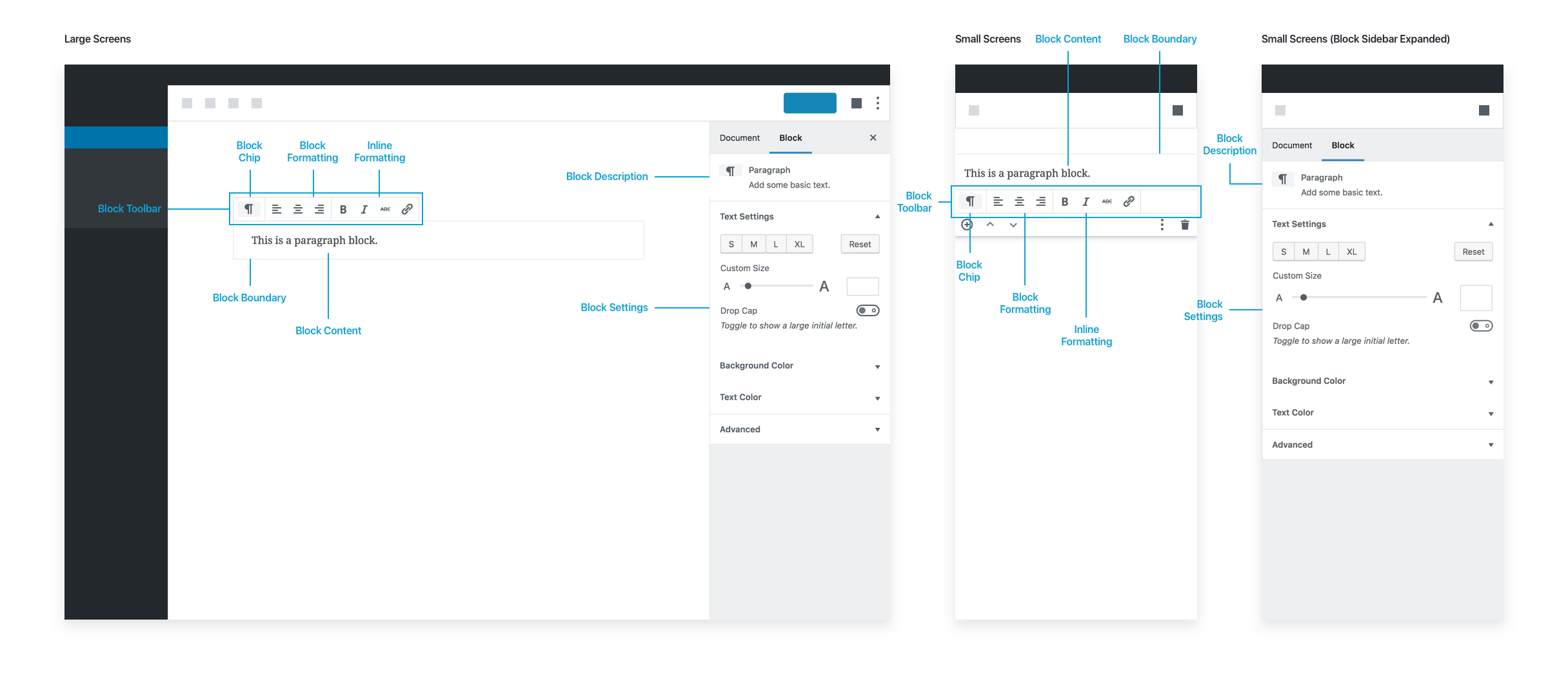
Image
Basic image block.
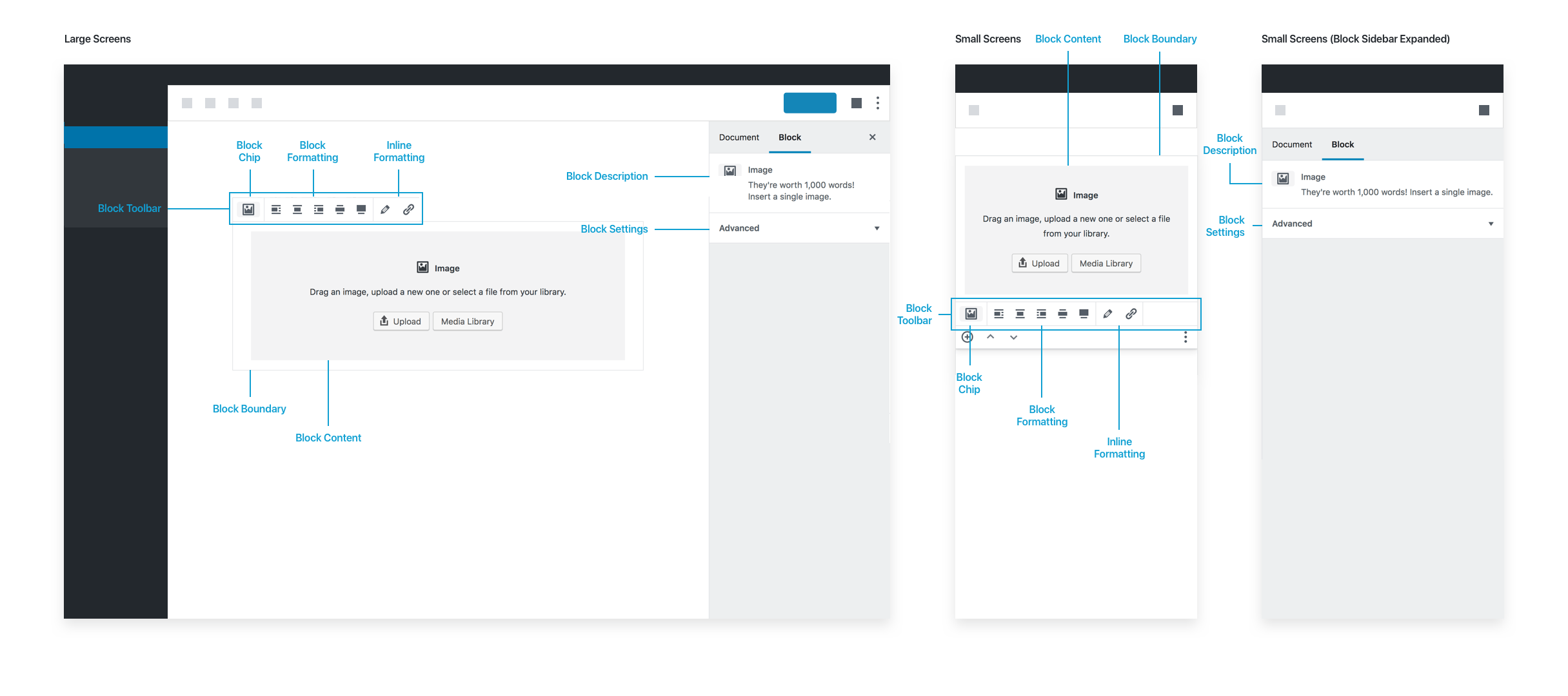
Placeholder
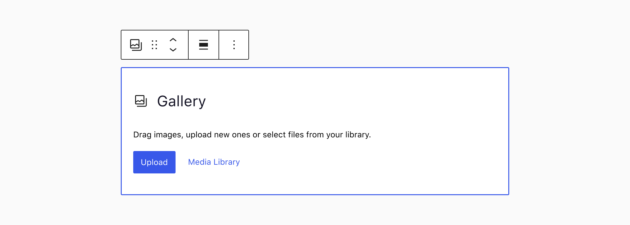
- A generic gray placeholder block with options to upload an image, drag and drop an image directly on it, or pick an image from the media library.
Selected state
- Block Toolbar: Alignments, including wide and full-width if the theme supports it.
- Block Toolbar: Edit Image, to open the Media Library
- Block Toolbar: Link button
- When an image is uploaded, a caption input field appears with a “Write caption…” placeholder text below the image:
Block settings
- Has description: “They’re worth 1,000 words! Insert a single image.”
- Has options for changing or adding alt text and adding additional custom CSS classes.
Future improvements to the Image block could include getting rid of the media modal in place of letting users select images directly from the placeholder itself. In general, try to avoid modals.
Latest Post
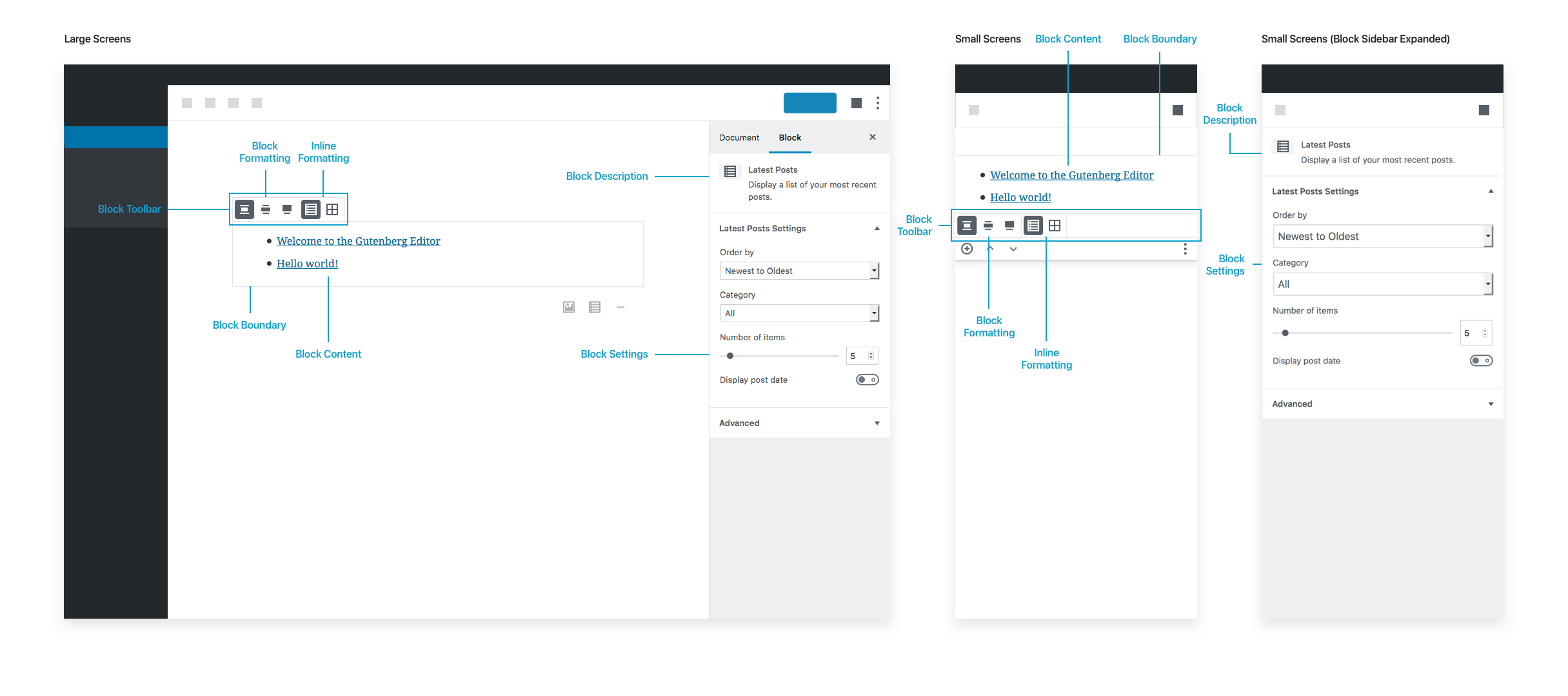
Placeholder
Has no placeholder as it works immediately upon insertion. The default inserted state shows the last 5 posts.
Selected state
- Block Toolbar: Alignments
- Block Toolbar: Options for picking list view or grid view
Note that the Block Toolbar does not include the Block Chip in this case, since there are no similar blocks to switch to.
Block settings
- Has description: “Display a list of your most recent posts.”
- Has options for post order, narrowing the list by category, changing the default number of posts to show, and showing the post date.
Latest Posts is fully functional as soon as it’s inserted because it comes with good defaults.