用户界面
概述
本文档介绍了 WordPress 块编辑器的用户界面布局和核心组件,包括块编辑器的一般结构、块的基本操作、设置侧边栏的功能以及块库的使用方式。
关键要点
- 块编辑器布局:顶部工具栏包含文档级操作,内容区域显示文档,设置侧边栏提供文档和块的额外设置,可通过齿轮按钮隐藏以提供沉浸式写作体验。
- 块作为基本单元:所有内容都是块,用户通过块构建文章和页面,模仿底层 HTML 标记的垂直流,每个块可独立操作,支持上下文特定功能。
- 块操作界面:选中块时显示块工具栏,包含块图标用于转换块类型或选择样式,块格式选项调整块级设置,内联格式选项调整块内元素,块移动器图标用于上下移动块,省略号菜单提供删除、复制、编辑为 HTML 等高级操作。
- 设置侧边栏:分为文档选项卡(显示编辑的帖子或页面的元数据和设置)和块选项卡(显示当前选中块的元数据和设置),每个选项卡包含可切换的侧边栏部分,高级配置应放在设置侧边栏中,基本操作应避免依赖侧边栏。
- 块库:在插入块时出现,块按可展开部分组织,搜索栏可自动过滤块列表,用户可通过选择块按钮或块名称来选择块。
注意事项
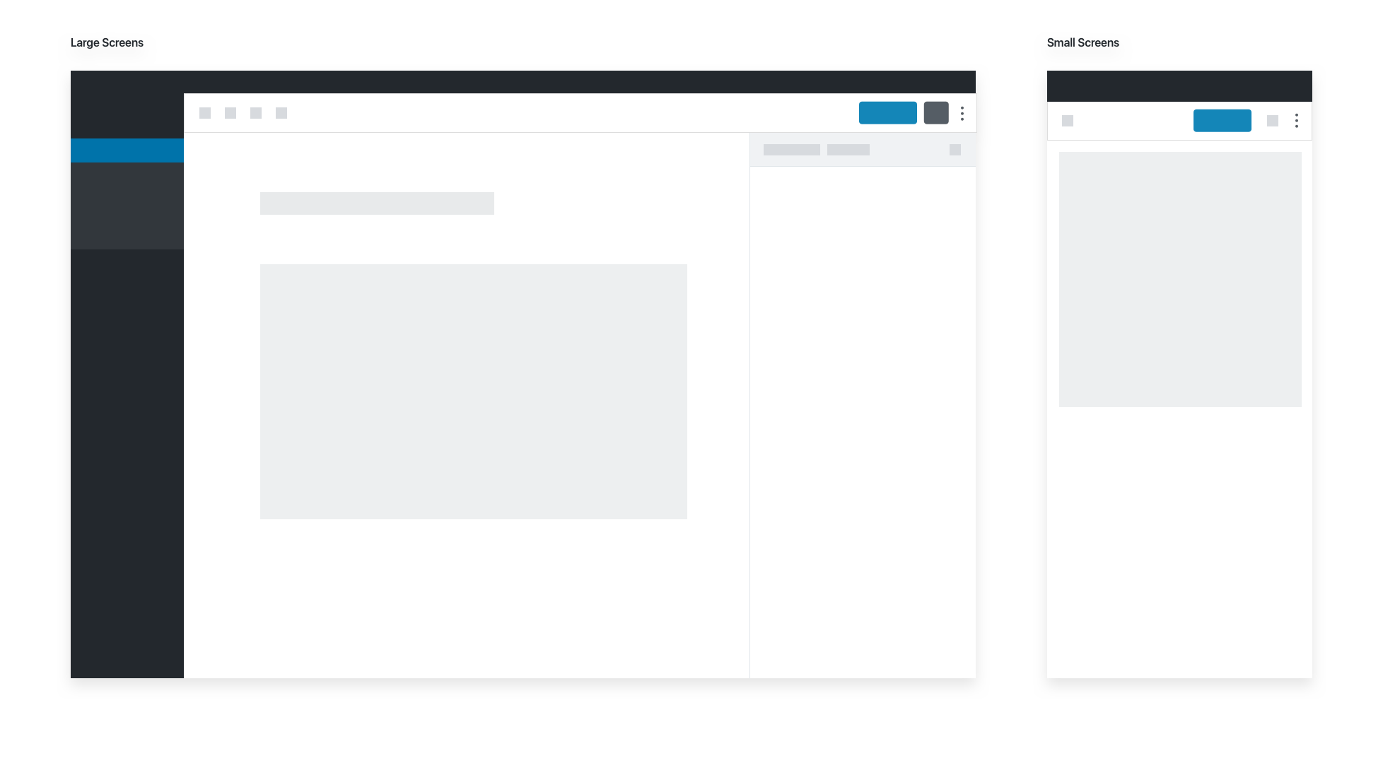
- 未选中的块不显示块工具栏或其他上下文控件,仅作为内容预览。
- 选择和焦点可以不同,例如图像块被选中时焦点可能在标题字段上。
- 在小屏幕上,侧边栏默认隐藏。
- 块编辑器旨在提供良好的默认设置,用户应能在无需高级操作的情况下创建完整文档。
The Block Editor
The block editor’s general layout uses a bar at the top, with content below.
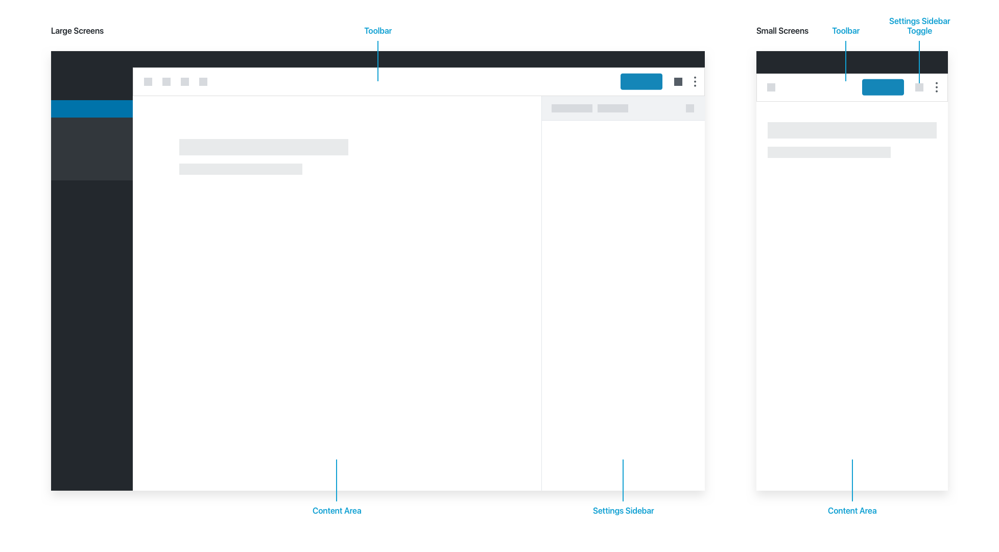
The Toolbar contains document-level actions: Editor/Select modes, save status, global actions for undo/redo/insert, the settings toggle, and publish options.
The Content Area contains the document itself.
The Settings Sidebar contains additional settings for the document (tags, categories, schedule etc.) and for blocks in the “Block” tab. A cog button in the toolbar hides the Settings Sidebar, allowing the user to enjoy a more immersive writing experience. On small screens, the sidebar is hidden by default.
The Block
The block itself is the most basic unit of the editor. Generally speaking, everything is a block. Users build posts and pages using blocks, mimicking the vertical flow of the underlying HTML markup.
By surfacing each section of the document as a manipulatable block, we surface block-specific features contextually. This is inspired by desktop app conventions, and allows for a breadth of advanced features without weighing down the UI.
A selected block shows a number of contextual actions:
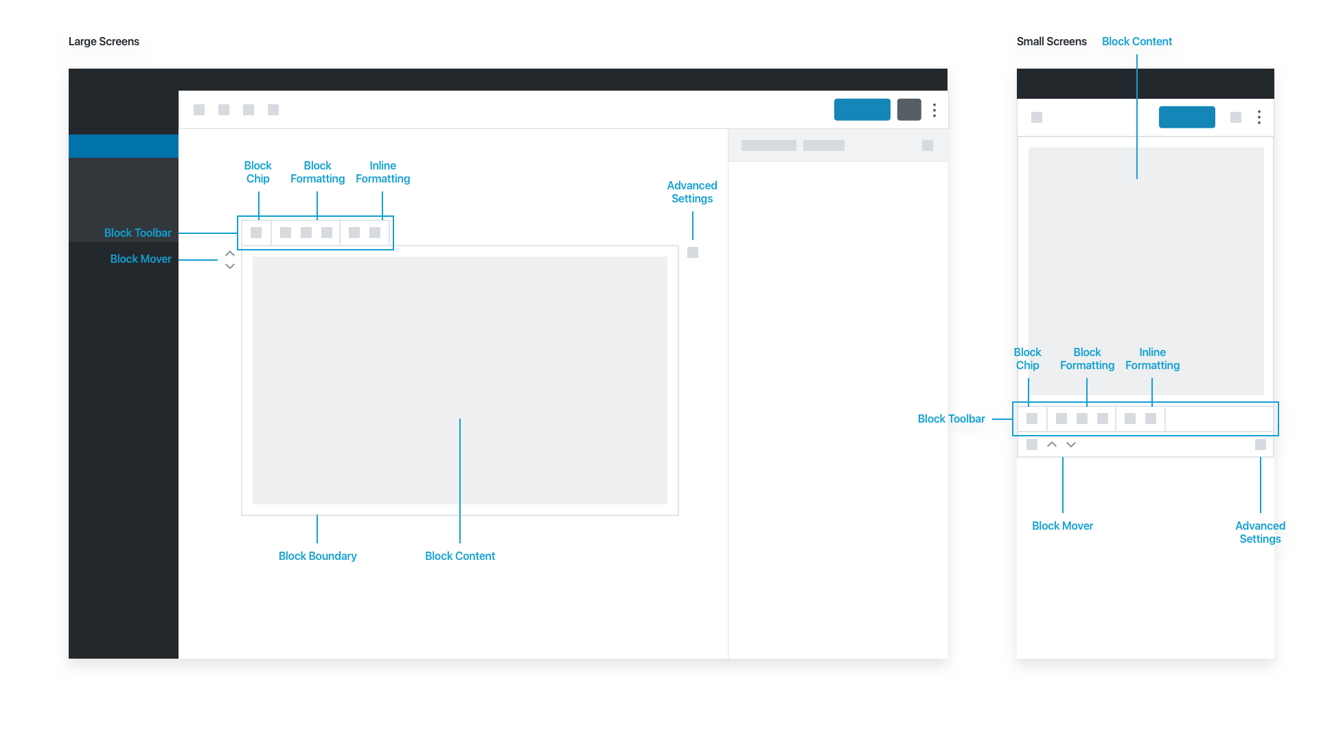
The block interface has basic actions. The block editor aims for good, common defaults, so users should be able to create a complete document without actually needing the advanced actions in the Settings Sidebar.
The Block Toolbar highlights commonly-used actions. The Block Icon lives in the block toolbar, and contains high-level controls for the selected block. It primarily allows users to transform a block into another type of compatible block. Some blocks also use the block icon for users to choose from a set of alternate block styles.
The Block Formatting options let users adjust block-level settings, and the Inline Formatting options allow adjustments to elements inside the block. When a block is long, the block toolbar pins itself to the top of the screen as the user scrolls down the page.
Blocks can be moved up and down via the Block Mover icons. Additional block actions are available via an ellipsis menu: deleting and duplicating blocks, as well as advanced actions like “Edit as HTML” and “Convert to Reusable Block.”
An unselected block does not show the block toolbar or any other contextual controls. In effect, an unselected block is a preview of the content itself:
Please note that selection and focus can be different. An image block can be selected while the focus is on the caption field.
Settings Sidebar
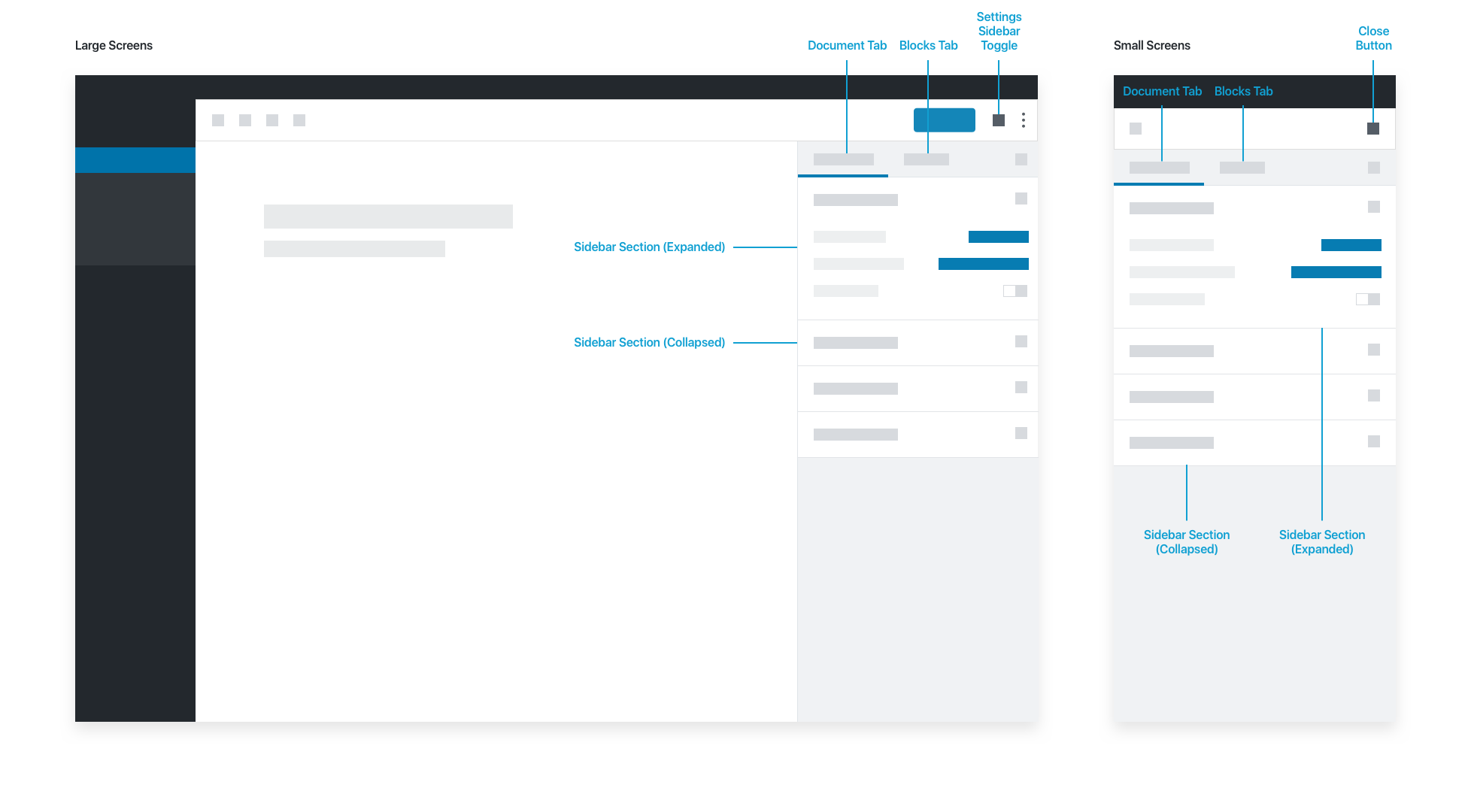
The sidebar has two tabs, Document and Block:
- The Document Tab shows metadata and settings for the post or page being edited.
- The Block Tab shows metadata and settings for the currently selected block.
Each tab has sets of editable fields (Sidebar Sections) that users can toggle open or closed.
If a block requires advanced configuration, those settings should live in the Settings Sidebar. Don’t put anything in the sidebar block tab that is necessary for the basic operation of your block; your user might dismiss the sidebar for an immersive writing experience. Pick good defaults, and make important actions available in the block toolbar.
Actions that could go in the block tab of the sidebar could be:
- Drop cap, for text
- Number of columns for galleries
- Number of posts, or category, in the “Latest Posts” block
- Any configuration that you don’t need access to in order to perform basic tasks
Block Library
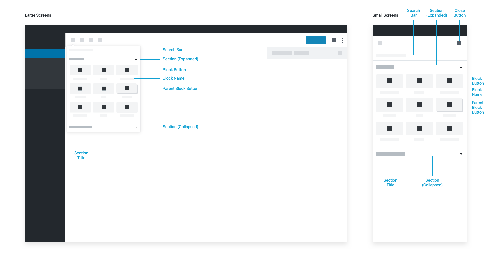
The Block Library appears when someone inserts a block, whether via the toolbar, or contextually within the content area. Inside, blocks are organized into expandable sections. The block library’s search bar auto-filters the list of blocks as the user types. Users can choose a block by selecting the Block Button or the Block Name.