TextControl
概述
TextControl 是 WordPress 组件库中用于用户输入和编辑文本的 React 组件,适用于单行自由文本输入场景。文档提供了设计指南、开发指南和属性说明,帮助开发者正确使用该组件。
关键要点
- TextControl 主要用于自由文本输入,不适合长文本或多选场景,应使用 TextArea 或其他约束组件如 SelectControl、RadioControl、CheckboxControl 或 RangeControl。
- 设计上需确保标签可见、容器清晰,避免使用占位符替代标签,并区分不同状态以提高可用性。
- 开发时需导入 @wordpress/components 中的 TextControl,并通过 props 如 label、value、onChange 等控制组件行为。
代码示例
import { useState } from 'react';
import { TextControl } from '@wordpress/components';

const MyTextControl = () => {
    const [ className, setClassName ] = useState( '' );

    return (
        <TextControl
            __next40pxDefaultSize
            label="Additional CSS Class"
            value={ className }
            onChange={ ( value ) => setClassName( value ) }
        />
    );
};
注意事项
- TextControl 是单行输入字段,不适合收集长响应,应使用 text area 替代。
- 标签必须始终可见,占位符文本不能替代标签,因为它会在用户输入时消失。
- props 如 label、value、onChange 是核心属性,需正确设置以确保组件功能正常。
TextControl components let users enter and edit text.
Design guidelines
Usage
When to use TextControls
TextControls are best used for free text entry. If you have a set of predefined options you want users to select from, it’s best to use a more constrained component, such as a SelectControl, RadioControl, CheckboxControl, or RangeControl.
Because TextControls are single-line fields, they are not suitable for collecting long responses. For those, use a text area instead.
TextControls should:
- Stand out and indicate that users can input information.
- Have clearly differentiated states (selected/unselected, active/inactive).
- Make it easy to understand the requested information and to address any errors.
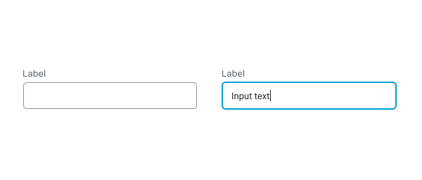
- Have visible labels; placeholder text is not an acceptable replacement for a label as it vanishes when users start typing.
Anatomy
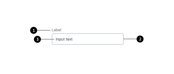
- Label
- Input container
- Input text
Label text
Label text is used to inform users as to what information is requested for a text field. Every text field should have a label. Label text should be above the input field, and always visible.
Containers
Containers improve the discoverability of text fields by creating contrast between the text field and surrounding content.
Do
A stroke around the container clearly indicates that users can input information.
Don’t
Don’t use unclear visual markers to indicate a text field.
Development guidelines
Usage
Render a user interface to input the name of an additional css class.
import { useState } from 'react';
import { TextControl } from '@wordpress/components';

const MyTextControl = () => {
    const [ className, setClassName ] = useState( '' );

    return (
        <TextControl
            __next40pxDefaultSize
            label="Additional CSS Class"
            value={ className }
            onChange={ ( value ) => setClassName( value ) }
        />
    );
};
Props
The set of props accepted by the component will be specified below.
Props not included in this set will be applied to the input element.
label
If this property is added, a label will be generated using label property as the content.
- Type:
String - Required: No
hideLabelFromVision
If true, the label will only be visible to screen readers.
- Type:
Boolean - Required: No
help
If this property is added, a help text will be generated using help property as the content.
- Type:
String - Required: No
type
Type of the input element to render. Defaults to “text”.
- Type:
String - Required: No
- Default: “text”
value
The current value of the input.
- Type:
String | Number - Required: Yes
className
The class that will be added with “components-base-control” to the classes of the wrapper div.
If no className is passed only components-base-control is used.
- Type:
String - Required: No
onChange
A function that receives the value of the input.
- Type:
function - Required: Yes
__next40pxDefaultSize
Start opting into the larger default height that will become the default size in a future version.
- Type:
Boolean - Required: No
- Default:
false
Related components
- To offer users more constrained options for input, use SelectControl, RadioControl, CheckboxControl, or RangeControl.