MenuItemsChoice
概述
MenuItemsChoice 是 WordPress 组件库中的一个组件,功能类似于一组 MenuItems,但允许用户从多个选项中选择一个。它通常用于 DropdownMenu 中,以提供单选功能。
关键要点
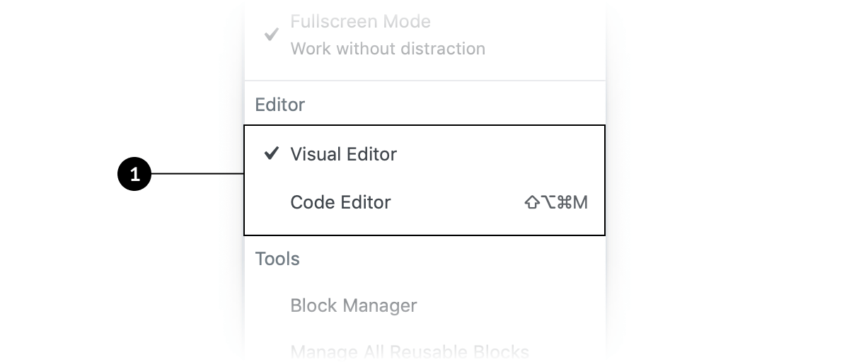
- MenuItemsChoice 应放置在独立的 MenuGroup 中,以区分于其他菜单项。
- 当用户选择一个选项时,其他选项会自动取消选中,并显示勾选图标。
- 适用于需要用户从一组选项中选择单个选项的场景,不应用于切换单个功能的开关。
- 默认情况下应有一个选项被选中,以引导用户选择并减少交互成本。
代码示例
import { useState } from 'react';
import { MenuGroup, MenuItemsChoice } from '@wordpress/components';

const MyMenuItemsChoice = () => {
    const [ mode, setMode ] = useState( 'visual' );
    const choices = [
        {
            value: 'visual',
            label: 'Visual editor',
        },
        {
            value: 'text',
            label: 'Code editor',
        },
    ];

    return (
        <MenuGroup label="Editor">
            <MenuItemsChoice
                choices={ choices }
                value={ mode }
                onSelect={ ( newMode ) => setMode( newMode ) }
            />
        </MenuGroup>
    );
};
注意事项
- 如果 MenuItemsChoice 中的项有键盘快捷键,应显示在菜单标题右侧,但选中项不应显示快捷键。
- 默认选中选项可以建议用户做出最佳决策,但需谨慎使用,避免误导。
MenuItemsChoice functions similarly to a set of MenuItems, but allows the user to select one option from a set of multiple choices.
Design guidelines
A MenuItemsChoice should be housed within in its own distinct MenuGroup, so that the set of options are distinct from nearby MenuItems.
Usage
MenuItemsChoice is used in a DropdownMenu to present users with a set of options. When one option in a MenuItemsChoice is selected, the others are automatically deselected.
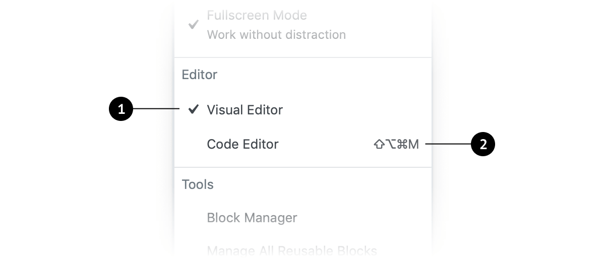
- A checkmark icon appears next to the choice when it’s enabled, and disappears when disabled.
- If an item in
MenuItemsChoicehas an associated keyboard shortcut, that should be displayed to the right of the menu title, aligned to the right side of the menu item. Selected choices should not have visible shortcuts, since they are already active.
When to use MenuItemsChoice
Use MenuItemsChoice when you want users to:
- Select a single option from a set of choices in a menu.
- Expose all available options.
MenuItemsChoice should not be used to toggle individual features on and off. For that, consider using a FeatureToggle.
Defaults
When using MenuItemsChoice , one option should be selected by default (i.e., when the page loads, in the case of a web application).
User control
Selecting an option by default communicates that the user is required to choose one in the set.
Expediting tasks
When one choice in a set of MenuItemsChoice is the most desirable or frequently selected, it’s helpful to select it by default. Doing this reduces the interaction cost and can save the user time and clicks.
The power of suggestion
Designs with a MenuItemsChoice option selected by default make a strong suggestion to the user. It can help them make the best decision and increase their confidence. (Use this guidance with caution, and only for good.)
Development guidelines
Usage
import { useState } from 'react';
import { MenuGroup, MenuItemsChoice } from '@wordpress/components';

const MyMenuItemsChoice = () => {
    const [ mode, setMode ] = useState( 'visual' );
    const choices = [
        {
            value: 'visual',
            label: 'Visual editor',
        },
        {
            value: 'text',
            label: 'Code editor',
        },
    ];

    return (
        <MenuGroup label="Editor">
            <MenuItemsChoice
                choices={ choices }
                value={ mode }
                onSelect={ ( newMode ) => setMode( newMode ) }
            />
        </MenuGroup>
    );
};