SelectControl
概述
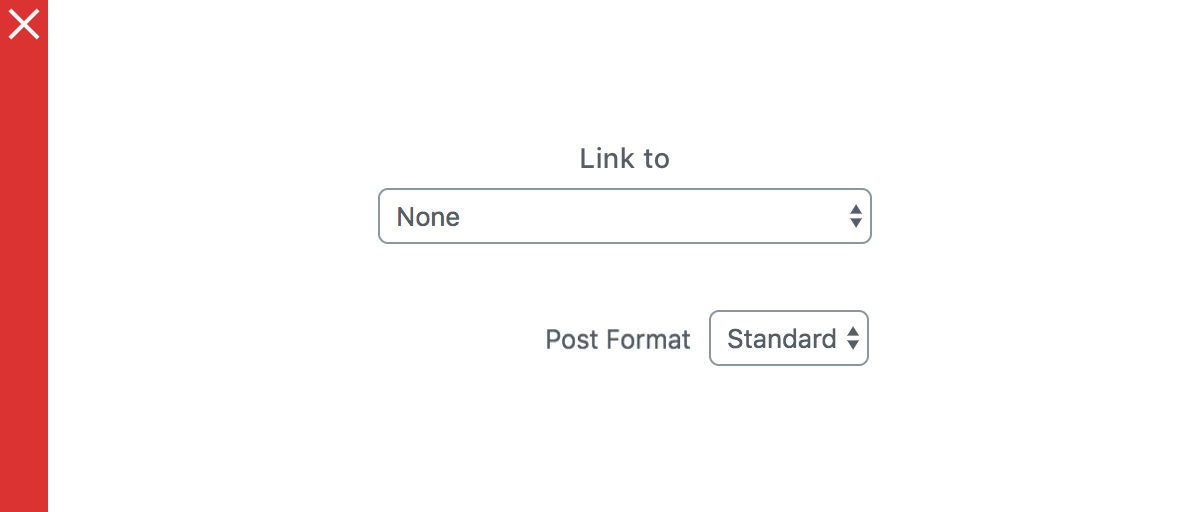
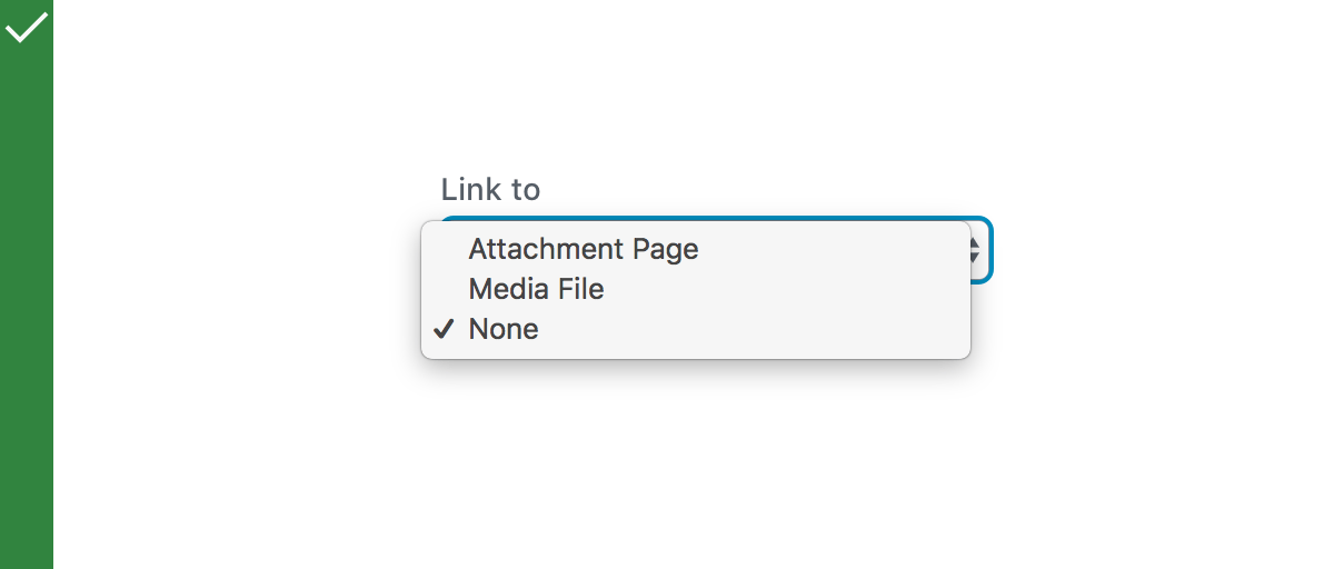
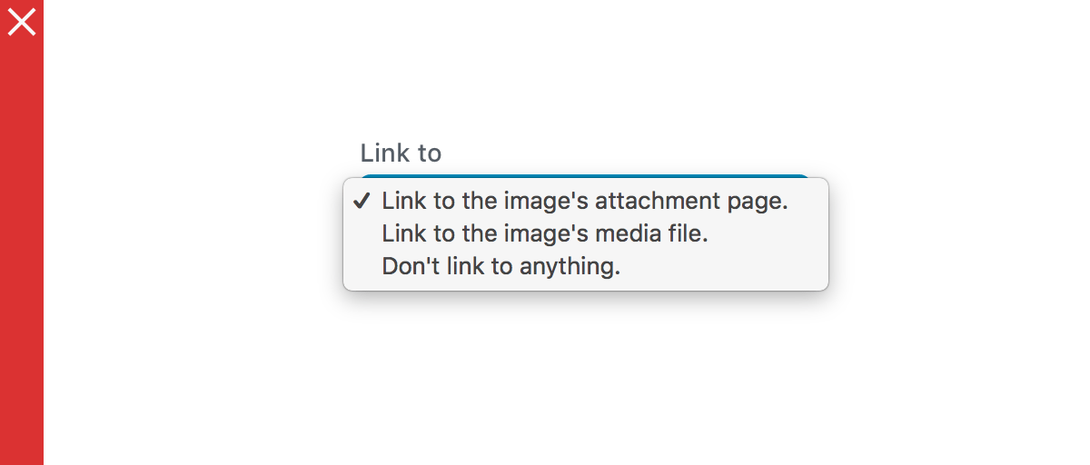
SelectControl 是 WordPress 组件库中的一个控件,用于创建单选或多选的下拉菜单,基于浏览器的原生
关键要点
- SelectControl 允许用户从单个或多个选项菜单中选择,支持单选和多选模式。
- 设计指南包括使用场景(如空间有限、有强默认选项时)、行为(如菜单打开和关闭方式)和内容规范(如标签位置、菜单项格式)。
- 开发指南提供了代码示例,展示如何渲染不同场景的 SelectControl,如选择图像大小、多选用户或分组选项。
- 核心 Props 包括 label、value、options、onChange、multiple 等,用于控制组件行为和外观。
- 相关组件包括 RadioControl(用于单选并显示所有选项)、CheckboxControl(用于多选)和 ToggleControl(用于开关切换)。
代码示例
import { useState } from 'react';
import { SelectControl } from '@wordpress/components';

const MySelectControl = () => {
    const [ size, setSize ] = useState( '50%' );

    return (
        <SelectControl
            label="Size"
            value={ size }
            options={ [
                { label: 'Big', value: '100%' },
                { label: 'Medium', value: '50%' },
                { label: 'Small', value: '25%' },
            ] }
            onChange={ ( newSize ) => setSize( newSize ) }
            __next40pxDefaultSize
        />
    );
};
注意事项
- 避免将 SelectControl 用于二元问题,考虑使用 ToggleControl 或其他控件。
- 当选项较少时,建议使用 RadioControl 替代,以提供更好的用户体验。
- 使用 multiple 属性时,value 应为数组;否则为单个值,需根据场景正确设置。
- 菜单项应简短,避免使用完整句子,并按字母顺序或最近使用顺序排序以提高可用性。
SelectControl allow users to select from a single or multiple option menu. It functions as a wrapper around the browser’s native <select> element.
Design guidelines
Usage
When to use a select control
Use a select control when:
- You want users to select one or more options from a list.
- There is a strong default option.
- There is little available space.
- The contents of the hidden part of the menu are obvious from its label and the one selected item. For example, if you have an option menu labelled “Month:” with the item “January” selected, the user might reasonably infer that the menu contains the 12 months of the year without having to look.
If you have a shorter list of options, consider using RadioControl instead.
Do
Use selects when you have multiple options.
Don’t
Use selects for binary questions.
Behavior
A SelectControl includes a double-arrow indicator. The menu appears layered over the select.
Opening and Closing
Once the menu is displayed onscreen, it remains open until the user chooses a menu item, clicks outside of the menu, or switches to another browser tab.
Content Guidelines
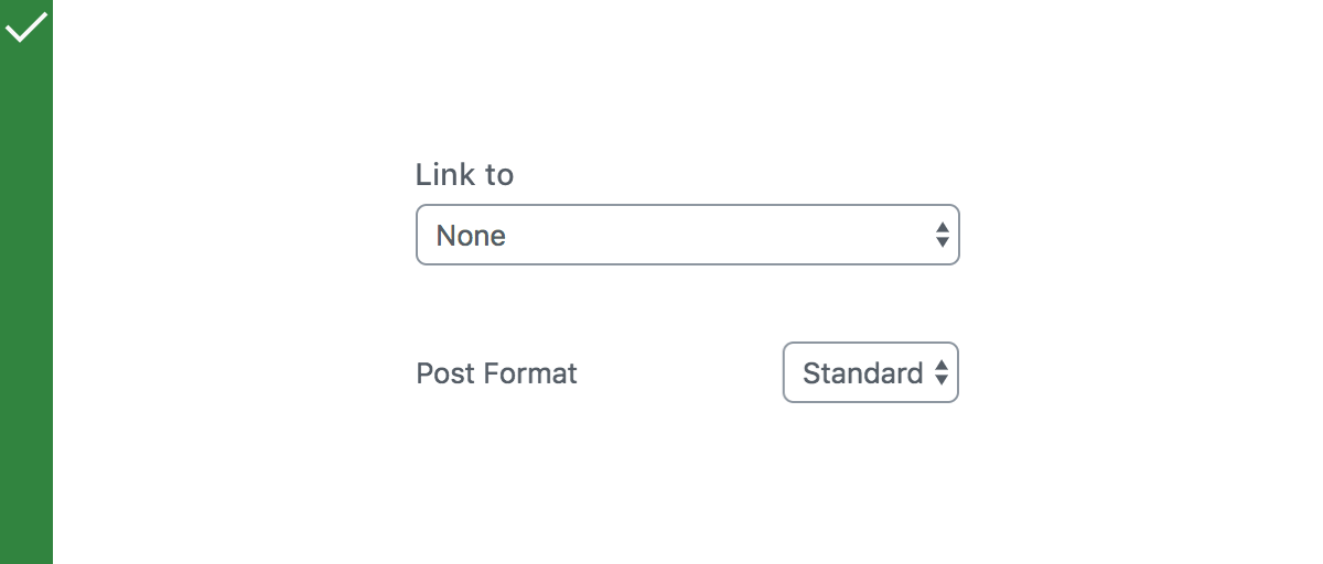
Labels
Label the SelectControl with a text label above it, or to its left, using sentence capitalization. Clicking the label allows the user to focus directly on the select.
Do
Position the label above, or to the left of, the select.
Don’t
Position the label centered over the select, or right aligned against the side of the select.
Menu Items
- Menu items should be short — ideally, single words — and use sentence capitalization.
- Do not use full sentences inside menu items.
- Ensure that menu items are ordered in a way that is most useful to users. Alphabetical or recency ordering is preferred.
Do
Use short menu items.
Don’t
Use sentences in your menu.
Development guidelines
Usage
Render a user interface to select the size of an image.
import { useState } from 'react';
import { SelectControl } from '@wordpress/components';

const MySelectControl = () => {
    const [ size, setSize ] = useState( '50%' );

    return (
        <SelectControl
            label="Size"
            value={ size }
            options={ [
                { label: 'Big', value: '100%' },
                { label: 'Medium', value: '50%' },
                { label: 'Small', value: '25%' },
            ] }
            onChange={ ( newSize ) => setSize( newSize ) }
            __next40pxDefaultSize
        />
    );
};
Render a user interface to select multiple users from a list.
<SelectControl
    multiple
    label={ __( 'User' ) }
    value={ this.state.users } // e.g: value = [ 'a', 'c' ]
    onChange={ ( users ) => {
        this.setState( { users } );
    } }
    options={ [
        { value: '', label: 'Select a User', disabled: true },
        { value: 'a', label: 'User A' },
        { value: 'b', label: 'User B' },
        { value: 'c', label: 'User c' },
    ] }
    __next40pxDefaultSize
/>
Render a user interface to select items within groups
const [ item, setItem ] = useState( '' );

// ...

<SelectControl
    label={ __( 'My dinosaur' ) }
    value={ item } // e.g: value = 'a'
    onChange={ ( selection ) => { setItem( selection ) } }
    __next40pxDefaultSize
>
    <optgroup label="Theropods">
        <option value="Tyrannosaurus">Tyrannosaurus</option>
        <option value="Velociraptor">Velociraptor</option>
        <option value="Deinonychus">Deinonychus</option>
    </optgroup>
    <optgroup label="Sauropods">
        <option value="Diplodocus">Diplodocus</option>
        <option value="Saltasaurus">Saltasaurus</option>
        <option value="Apatosaurus">Apatosaurus</option>
    </optgroup>
</SelectControl>
Props
- The set of props accepted by the component will be specified below.
- Props not included in this set will be applied to the select element.
- One important prop to refer is
value. Ifmultipleistrue,valueshould be an array with the values of the selected options. - If
multipleisfalse,valueshould be equal to the value of the selected option.
label
If this property is added, a label will be generated using label property as the content.
- Type:
String - Required: No
labelPosition
The position of the label (top, side, or bottom).
- Type:
String - Required: No
hideLabelFromVision
If true, the label will only be visible to screen readers.
- Type:
Boolean - Required: No
help
If this property is added, a help text will be generated using help property as the content.
- Type:
String|Element - Required: No
multiple
If this property is added, multiple values can be selected. The value passed should be an array.
In most cases, it is preferable to use the FormTokenField or CheckboxControl components instead.
- Type:
Boolean - Required: No
options
An array of objects containing the following properties, as well as any other option element attributes:
label: (string) The label to be shown to the user.value: (string) The internal value used to choose the selected value. This is also the value passed to onChange when the option is selected.disabled: (boolean) Whether or not the option should have the disabled attribute.- Type:
Array - Required: No
children
An alternative to the options prop.
Use the children prop to have more control on the style of the items being rendered, like optgroups or options and possibly avoid re-rendering due to the reference update on the options prop.
– Type: ReactNode
– Required: No
onChange
A function that receives the value of the new option that is being selected as input.
If multiple is true the value received is an array of the selected value.
If multiple is false the value received is a single value with the new selected value.
- Type:
function - Required: Yes
value
The value of the selected option. If multiple is true, the value should be an array with the values of the selected options.
- Type:
String|String[] - Required: No
variant
The style variant of the control.
- Type:
'default' | 'minimal' - Required: No
- Default:
'default'
__next40pxDefaultSize
Start opting into the larger default height that will become the default size in a future version.
- Type:
Boolean - Required: No
- Default:
false
Related components
- To select one option from a set, and you want to show them all the available options at once, use the
Radiocomponent. - To select one or more items from a set, use the
CheckboxControlcomponent. - To toggle a single setting on or off, use the
ToggleControlcomponent.