DateTime
概述
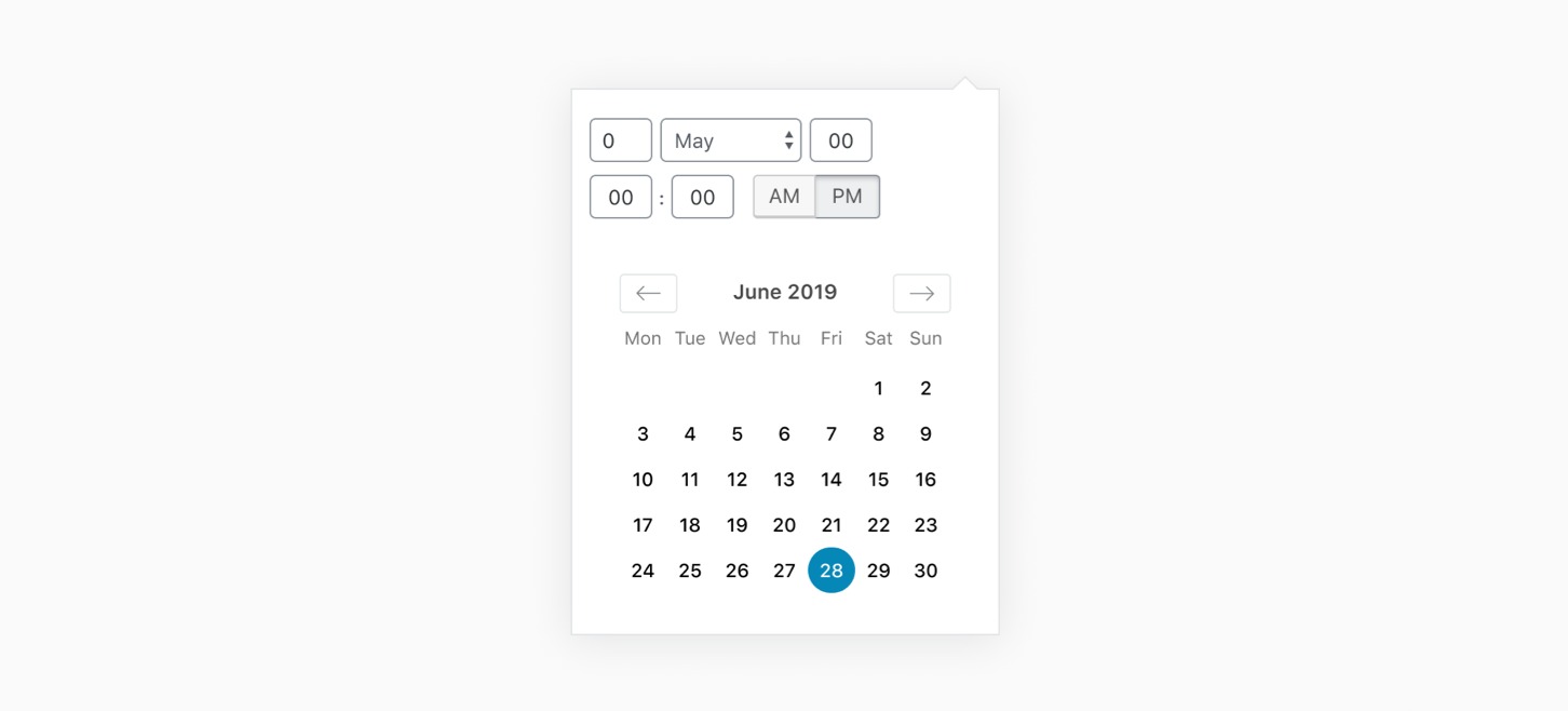
DateTimePicker 是一个 React 组件,用于渲染日期和时间选择的日历和时钟界面。它基于 WordPress 组件库,支持通过 DatePicker 和 TimePicker 单独访问子组件。
关键要点
- 组件提供日期和时间选择功能,可自定义初始日期、时间格式和日期顺序。
- 支持回调函数如 onChange 处理日期变更,isInvalidDate 验证日期有效性。
- 可配置事件显示、周起始日和月份预览回调,增强交互性。
代码示例
import { useState } from 'react';
import { DateTimePicker } from '@wordpress/components';

const MyDateTimePicker = () => {
    const [ date, setDate ] = useState( new Date() );

    return (
        <DateTimePicker
            currentDate={ date }
            onChange={ ( newDate ) => setDate( newDate ) }
            is12Hour={ true }
        />
    );
};
注意事项
- 使用智能默认值并高亮当前日期,以提升用户体验。
- 注意 is12Hour 和 dateOrder 属性对时间格式的影响,确保日期显示符合预期。
DateTimePicker is a React component that renders a calendar and clock for date and time selection. The calendar and clock components can be accessed individually using the DatePicker and TimePicker components respectively.
Best practices
Date pickers should:
- Use smart defaults and highlight the current date.
Usage
Render a DateTimePicker.
import { useState } from 'react';
import { DateTimePicker } from '@wordpress/components';

const MyDateTimePicker = () => {
    const [ date, setDate ] = useState( new Date() );

    return (
        <DateTimePicker
            currentDate={ date }
            onChange={ ( newDate ) => setDate( newDate ) }
            is12Hour={ true }
        />
    );
};
Props
The component accepts the following props:
currentDate: Date | string | number | null
The current date and time at initialization. Optionally pass in a null value to specify no date is currently selected.
- Required: No
- Default: today’s date
onChange: ( date: string | null ) => void
The function called when a new date or time has been selected. It is passed the currentDate as an argument.
- Required: No
is12Hour: boolean
Whether we use a 12-hour clock. With a 12-hour clock, an AM/PM widget is displayed and the time format is assumed to be MM-DD-YYYY (as opposed to the default format DD-MM-YYYY).
- Type:
bool - Required: No
- Default: false
dateOrder: 'dmy' | 'mdy' | 'ymd'
The order of day, month, and year. This prop overrides the time format determined by is12Hour prop.
- Type:
string - Required: No
- Default:
'dmy'
isInvalidDate: ( date: Date ) => boolean
A callback function which receives a Date object representing a day as an argument, and should return a Boolean to signify if the day is valid or not.
- Required: No
onMonthPreviewed: ( date: string ) => void
A callback invoked when selecting the previous/next month in the date picker. The callback receives the new month date in the ISO format as an argument.
- Required: No
events: { date: Date }[]
List of events to show in the date picker. Each event will appear as a dot on the day of the event.
- Type:
Array - Required: No
startOfWeek: number
The day that the week should start on. 0 for Sunday, 1 for Monday, etc.
- Required: No
- Default: 0