TabPanel
概述
TabPanel 是一个 React 组件,用于渲染符合 ARIA 标准的选项卡面板,帮助组织和导航相关且层级相同的内容组。它包含选项卡列表和选中时的视图显示两部分。
关键要点
- TabPanel 用于组织和导航相关且层级相同的内容组,所有选项卡应围绕共享主题统一,内容需相互区分。
- 组件结构包括容器、活动文本标签、活动选项卡指示器、非活动文本标签和选项卡项,标签应清晰简洁,可换行但不可多行排列。
- 活动选项卡通过下划线和颜色变化突出显示,用户可通过键盘 Tab 键导航,选项卡通常放置在内容上方以控制下方 UI 区域。
- 开发时需导入 @wordpress/components 中的 TabPanel,并通过 props 如 className、orientation、onSelect、tabs 等配置组件行为。
代码示例
import { TabPanel } from '@wordpress/components';

const onSelect = ( tabName ) => {
    console.log( 'Selecting tab', tabName );
};

const MyTabPanel = () => (
    <TabPanel
        className="my-tab-panel"
        activeClass="active-tab"
        onSelect={ onSelect }
        tabs={ [
            {
                name: 'tab1',
                title: 'Tab 1',
                className: 'tab-one',
            },
            {
                name: 'tab2',
                title: 'Tab 2',
                className: 'tab-two',
            },
        ] }
    >
        { ( tab ) => <p>{ tab.title }</p> }
    </TabPanel>
);
注意事项
- tabs 数组中的对象可包含 name、title、className、icon、disabled 等属性,其他字段也可添加并通过子函数访问。
- selectOnMove 属性控制选项卡激活方式:true 为自动激活(获得焦点时选择),false 为手动激活(仅点击时选择),默认值为 true。
TabPanel is a React component to render an ARIA-compliant TabPanel.
TabPanels organize content across different screens, data sets, and interactions. It has two sections: a list of tabs, and the view to show when tabs are chosen.
Design guidelines
Usage
TabPanels organize and allow navigation between groups of content that are related and at the same level of hierarchy.
Tabs in a set
As a set, all tabs are unified by a shared topic. For clarity, each tab should contain content that is distinct from all the other tabs in a set.
Anatomy
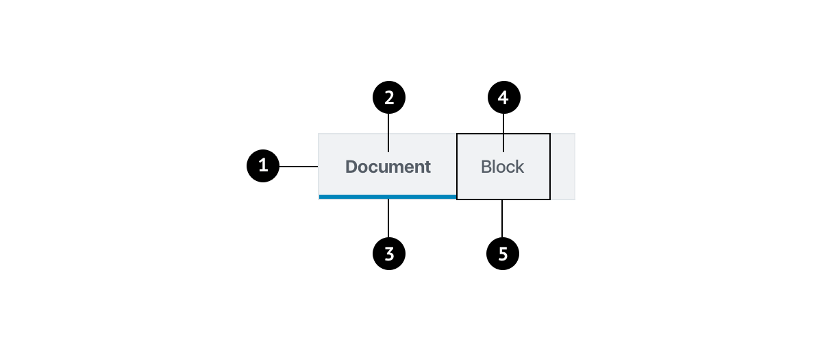
- Container
- Active text label
- Active tab indicator
- Inactive text label
- Tab item
Labels
Tab labels appear in a single row, in the same typeface and size. Use text labels that clearly and succinctly describe the content of a tab, and make sure that a set of tabs contains a cohesive group of items that share a common characteristic.
Tab labels can wrap to a second line, but do not add a second row of tabs.
Active tab indicators
To differentiate an active tab from an inactive tab, apply an underline and color change to the active tab’s text and icon.
Behavior
Users can navigate between tabs by tapping the tab key on the keyboard.
Placement
Place tabs above content. Tabs control the UI region displayed below them.
Development guidelines
Usage
import { TabPanel } from '@wordpress/components';

const onSelect = ( tabName ) => {
    console.log( 'Selecting tab', tabName );
};

const MyTabPanel = () => (
    <TabPanel
        className="my-tab-panel"
        activeClass="active-tab"
        onSelect={ onSelect }
        tabs={ [
            {
                name: 'tab1',
                title: 'Tab 1',
                className: 'tab-one',
            },
            {
                name: 'tab2',
                title: 'Tab 2',
                className: 'tab-two',
            },
        ] }
    >
        { ( tab ) => <p>{ tab.title }</p> }
    </TabPanel>
);
Props
The component accepts the following props:
className
The class to give to the outer container for the TabPanel
- Type:
String - Required: No
- Default: ''
orientation
The orientation of the tablist (vertical or horizontal)
- Type:
String - Required: No
- Default:
horizontal
onSelect
The function called when a tab has been selected. It is passed the tabName as an argument.
- Type:
Function - Required: No
- Default:
noop
tabs
An array of objects containing the following properties:
name:(string)Defines the key for the tab.title:(string)Defines the translated text for the tab.className:(string)Optional. Defines the class to put on the tab.icon:(ReactNode)Optional. When set, displays the icon in place of the tab title. The title is then rendered as an aria-label and tooltip.disabled:(boolean)Optional. Determines if the tab should be disabled or selectable.
Note: Other fields may be added to the object and accessed from the child function if desired.
- Type:
Array - Required: Yes
activeClass
The class to add to the active tab
- Type:
String - Required: No
- Default:
is-active
initialTabName
The name of the tab to be selected upon mounting of component. If this prop is not set, the first tab will be selected by default.
- Type:
String - Required: No
- Default: none
selectOnMove
When true, the tab will be selected when receiving focus (automatic tab activation). When false, the tab will be selected only when clicked (manual tab activation). See the official W3C docs for more info.
- Type:
boolean - Required: No
- Default:
true
children
A function which renders the tabviews given the selected tab. The function is passed the active tab object as an argument as defined the tabs prop.
- Type: (
Object) =>Element - Required: Yes