RangeControl
概述
RangeControl 是 WordPress 组件库中的一个滑块控件,用于从一系列增量值中选择单个值。它适用于调整音量、不透明度或文本大小等设置,提供连续或离散的交互方式。
关键要点
- RangeControl 包含轨道、滑块、值输入字段等元素,支持图标和刻度标记作为可选组件。
- 分为连续滑块(不显示具体数值)和离散滑块(显示可编辑数值),后者可配合刻度标记使用。
- 交互行为包括点击拖动、点击跳转、键盘箭头控制等,确保即时反馈效果。
- 开发时需导入 @wordpress/components 中的 RangeControl,通过 props 如 value、onChange、min、max 进行配置。
- 提供丰富的 props 如 marks、allowReset、withInputField 等,支持自定义样式和功能。
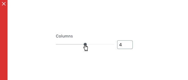
代码示例
import { useState } from 'react';
import { RangeControl } from '@wordpress/components';

const MyRangeControl = () => {
    const [ columns, setColumns ] = useState( 2 );

    return (
        <RangeControl
            __next40pxDefaultSize
            label="Columns"
            value={ columns }
            onChange={ ( value ) => setColumns( value ) }
            min={ 2 }
            max={ 10 }
        />
    );
};
注意事项
- RangeControl 仅用于从范围值中选择,避免用于仅有 2 个值的情况。
- 确保提供完整的可选范围,不要禁用部分轨道。
- 变化应即时生效,不适合与有延迟反馈的设置配对使用。
RangeControls are used to make selections from a range of incremental values.
Design guidelines
Anatomy
A RangeControl can contain the following elements:
- Rail: The rail represents the entire surface area of the slider, from the minimum value selectable by the user to the maximum value selectable by the user. For left-to-right (LTR) languages, the minimum value appears on the far left, and the maximum value on the far right. For right-to-left (RTL) languages this orientation is reversed, with the minimum value on the far right and the maximum value on the far left.
- Track: The track represents the portion of the rail from the minimum value to the currently selected value.
- Thumb: The thumb slides along the track, displaying the selected value through its position.
- Value entry field: The value entry field displays the currently selected, specific numerical value.
- Icon (optional): An icon can be displayed before or after the slider.
- Tick mark (optional): Tick marks represent predetermined values to which the user can move the slider.
Types
Continuous sliders
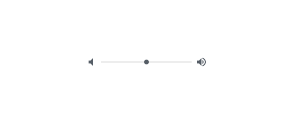
Continuous sliders allow users to select a value along a subjective range. They do not display the selected numeric value. Use them when displaying/editing the numeric value is not important, like volume.
Discrete sliders
Discrete sliders can be adjusted to a specific value by referencing its value entry field. Use them when it’s important to display/edit the numeric value, like text size.
Possible selections may be organized through the use of tick marks, which a thumb will snap to (or to which an input will round up or down).
Behavior
- Click and drag: The slider is controlled by clicking the thumb and dragging it.
- Click jump: The slider is controlled by clicking the track.
- Click and arrow: The slider is controlled by clicking the thumb, then using arrow keys to move it.
- Tab and arrow: The slider is controlled by using the tab key to select the thumb of the desired slider, then using arrow keys to move it.
- Value entry field: Discrete sliders have value entry fields. After a text entry is made, the slider position automatically updates to reflect the new value.
- Tick marks (Optional) Discrete sliders can use evenly spaced tick marks along the slider track, and the thumb will snap to them. Each tick mark should change the setting in increments that are discernible to the user.
Usage
RangeControls reflect a range of values along a track, from which users may select a single value. They are ideal for adjusting settings such as volume, opacity, or text size.
RangeControls can have icons on both ends of the track that reflect a range of values.
Immediate effects
Changes made with RangeControls are immediate, allowing a user to make adjustments until finding their preference. They shouldn’t be paired with settings that have delays in providing feedback.
Don’t
Don’t use RangeControls if the effect isn’t immediate.
Current state
RangeControls reflect the current state of the settings they control.
Values
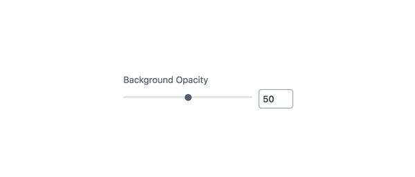
A RangeControl with an editable numeric value
Editable numeric values: Editable numeric values allow users to set the exact value of a RangeControl. After setting a value, the thumb position is immediately updated to match the new value.
Don’t
RangeControls should only be used for choosing selections from a range of values (e.g., don’t use a RangeControl if there are only 2 values).
Don’t
RangeControls should provide the full range of choices available for the user to select from (e.g., don’t disable only part of a RangeControl).
Development guidelines
Usage
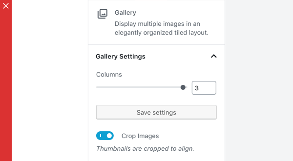
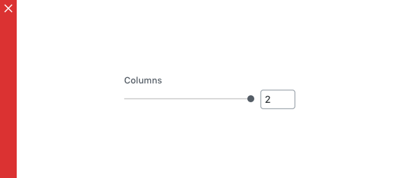
Render a RangeControl to make a selection from a range of incremental values.
import { useState } from 'react';
import { RangeControl } from '@wordpress/components';

const MyRangeControl = () => {
    const [ columns, setColumns ] = useState( 2 );

    return (
        <RangeControl
            __next40pxDefaultSize
            label="Columns"
            value={ columns }
            onChange={ ( value ) => setColumns( value ) }
            min={ 2 }
            max={ 10 }
        />
    );
};
Props
The set of props accepted by the component will be specified below.
Props not included in this set will be applied to the input elements.
afterIcon: string|Function|Component|null
If this property is added, an Icon component will be rendered after the slider with the icon equal to afterIcon.
For more information on IconType see the Icon component.
- Required: No
- Platform: Web
allowReset: boolean
If this property is true, a button to reset the slider is rendered.
- Required: No
- Default:
false - Platform: Web | Mobile
beforeIcon: string|Function|Component|null
If this property is added, an Icon component will be rendered before the slider with the icon equal to beforeIcon.
For more information on IconType see the Icon component.
- Required: No
- Platform: Web
color: CSSProperties['color']
CSS color string for the RangeControl wrapper.
- Required: No
- Platform: Web
currentInput: number
The current input to use as a fallback if value is currently undefined.
- Required: No
- Platform: Web
disabled: boolean
Disables the input, preventing new values from being applied.
- Required: No
- Platform: Web
help: string|Element
If this property is added, a help text will be generated using help property as the content.
- Required: No
- Platform: Web
hideLabelFromVision: boolean
Provides control over whether the label will only be visible to screen readers.
- Required: No
icon: string
An icon to be shown above the slider next to its container title.
- Required: No
- Platform: Mobile
initialPosition: number
The slider starting position, used when no value is passed. The initialPosition will be clamped between the provided min and max prop values.
- Required: No
- Platform: Web | Mobile
isShiftStepEnabled: boolean
Passed as a prop to the NumberControl component and is only applicable if withInputField is true. If true, while the number input has focus, pressing UP or DOWN along with the SHIFT key will change the value by the shiftStep value.
- Required: No
label: string
If this property is added, a label will be generated using label property as the content.
- Required: No
- Platform: Web | Mobile
marks: Array|boolean
Renders a visual representation of step ticks. Custom mark indicators can be provided by an Array.
Example:
const marks = [
    {
        value: 0,
        label: '0',
    },
    {
        value: 1,
        label: '1',
    },
    {
        value: 8,
        label: '8',
    },
    {
        value: 10,
        label: '10',
    },
];

const MyRangeControl() {
    return ( <RangeControl marks={ marks } min={ 0 } max={ 10 } step={ 1 } /> )
}
- Required: No
- Platform: Web
onBlur: FocusEventHandler< HTMLInputElement >
Callback for when RangeControl input loses focus.
- Required: No
- Platform: Web
onChange: ( value?: number ) => void
A function that receives the new value. The value will be less than max and more than min unless a reset (enabled by allowReset) has occurred. In which case the value will be either that of resetFallbackValue if it has been specified or otherwise undefined.
- Required: No
- Platform: Web | Mobile
onFocus: FocusEventHandler< HTMLInputElement >
Callback for when RangeControl input gains focus.
- Required: No
- Platform: Web
onMouseLeave: MouseEventHandler< HTMLInputElement >
Callback for when mouse exits the RangeControl.
- Required: No
- Platform: Web
onMouseMove: MouseEventHandler< HTMLInputElement >
Callback for when mouse moves within the RangeControl.
- Required: No
- Platform: Web
min: number
The minimum value allowed.
- Required: No
- Default: 0
- Platform: Web | Mobile
max: number
The maximum value allowed.
- Required: No
- Default: 100
- Platform: Web | Mobile
railColor: CSSProperties[ 'color' ]
CSS color string to customize the rail element’s background.
- Required: No
- Platform: Web
renderTooltipContent: ( value ) => value
A way to customize the rendered UI of the value. Example:
const customTooltipContent = value => `${value}%`

const MyRangeControl() {
    return (<RangeControl renderTooltipContent={ customTooltipContent } />)
}
- Required: No
- Platform: Web
resetFallbackValue: number
The value to revert to if the Reset button is clicked (enabled by allowReset)
- Required: No
- Platform: Web
separatorType: 'none' | 'fullWidth' | 'topFullWidth'
Define if separator line under/above control row should be disabled or full width. By default it is placed below excluding underline the control icon.
- Required: No
- Platform: Mobile
shiftStep: number
Passed as a prop to the NumberControl component and is only applicable if withInputField and isShiftStepEnabled are both true and while the number input has focus. Acts as a multiplier of step.
- Required: No
showTooltip: boolean
Forcing the Tooltip UI to show or hide. This is overridden to false when step is set to the special string value any.
- Required: No
- Platform: Web
step: number | 'any'
The minimum amount by which value changes. It is also a factor in validation as value must be a multiple of step (offset by min) to be valid. Accepts the special string value any that voids the validation constraint and overrides both withInputField and showTooltip props to false.
- Required: No
- Platform: Web
trackColor: CSSProperties[ 'color' ]
CSS color string to customize the track element’s background.
- Required: No
- Platform: Web
type: string
Define if the value selection should present a stepper control or a slider control in the bottom sheet on mobile. To use the stepper set the type value as stepper. Defaults to slider if no option is provided.
- Required: No
- Platform: Mobile
value: number
The current value of the range slider.
- Required: No
- Platform: Web | Mobile
withInputField: boolean
Determines if the input number field will render next to the RangeControl. This is overridden to false when step is set to the special string value any.
- Required: No
- Platform: Web
__next40pxDefaultSize: boolean
Start opting into the larger default height that will become the default size in a future version.
- Required: No
- Default:
false
Related components
- To collect a numerical input in a text field, use the
TextControlcomponent.