RadioGroup
云策文档标注
概述
RadioGroup 是一个已弃用的实验性组件,用于让用户从少量选项中选择一个。建议开发者改用 RadioControl 或 ToggleGroupControl。
关键要点
- RadioGroup 已弃用且处于实验阶段,可能发生重大变更,推荐使用 RadioControl 或 ToggleGroupControl 替代。
- 适用于用户从少量选项中选择一个的场景,一次只能有一个选项被选中。
- 设计指南强调清晰标签、默认选中、状态可见性(如活动、悬停、禁用)和界面一致性。
- 开发指南提供受控和非受控两种使用方式,通过 onChange 和 defaultChecked 属性管理状态。
- 相关组件包括 ButtonGroup(用于相关按钮)和 RadioControl(用于传统单选选项)。
代码示例
import { useState } from 'react';
import {
__experimentalRadio as Radio,
__experimentalRadioGroup as RadioGroup,
} from '@wordpress/components';
const MyControlledRadioRadioGroup = () => {
const [ checked, setChecked ] = useState( '25' );
return (
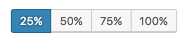
<RadioGroup label="Width" onChange={ setChecked } checked={ checked }>
<Radio __next40pxDefaultSize value="25">25%</Radio>
<Radio __next40pxDefaultSize value="50">50%</Radio>
<Radio __next40pxDefaultSize value="75">75%</Radio>
<Radio __next40pxDefaultSize value="100">100%</Radio>
</RadioGroup>
);
};import { useState } from 'react';
import {
__experimentalRadio as Radio,
__experimentalRadioGroup as RadioGroup,
} from '@wordpress/components';
const MyUncontrolledRadioRadioGroup = () => {
return (
<RadioGroup label="Width" defaultChecked="25">
<Radio __next40pxDefaultSize value="25">25%</Radio>
<Radio __next40pxDefaultSize value="50">50%</Radio>
<Radio __next40pxDefaultSize value="75">75%</Radio>
<Radio __next40pxDefaultSize value="100">100%</Radio>
</RadioGroup>
);
};
原文内容
This component is deprecated. Consider using `RadioControl` or `ToggleGroupControl` instead.
This feature is still experimental. “Experimental” means this is an early implementation subject to drastic and breaking changes.
Use a RadioGroup component when you want users to select one option from a small set of options.
Design guidelines
Usage
Selected action
Only one option in a radio group can be selected and active at a time. Selecting one option deselects any other.
Best practices
Radio groups should:
- Be clearly and accurately labeled.
- Clearly communicate that clicking or tapping will trigger an action.
- Use established colors appropriately. For example, only use red buttons for actions that are difficult or impossible to undo.
- Have consistent locations in the interface.
- Have a default option already selected.
States
Active and available radio groups
A radio group’s state makes it clear which option is active. Hover and focus states express the available selection options for buttons in a button group.
Disabled radio groups
Radio groups that cannot be selected can either be given a disabled state, or be hidden.
Development guidelines
Usage
Controlled
import { useState } from 'react';
import {
__experimentalRadio as Radio,
__experimentalRadioGroup as RadioGroup,
} from '@wordpress/components';
const MyControlledRadioRadioGroup = () => {
const [ checked, setChecked ] = useState( '25' );
return (
<RadioGroup label="Width" onChange={ setChecked } checked={ checked }>
<Radio __next40pxDefaultSize value="25">25%</Radio>
<Radio __next40pxDefaultSize value="50">50%</Radio>
<Radio __next40pxDefaultSize value="75">75%</Radio>
<Radio __next40pxDefaultSize value="100">100%</Radio>
</RadioGroup>
);
};
Uncontrolled
When using the RadioGroup component as an uncontrolled component, the default value can be set with the defaultChecked prop.
import { useState } from 'react';
import {
    __experimentalRadio as Radio,
    __experimentalRadioGroup as RadioGroup,
} from '@wordpress/components';

const MyUncontrolledRadioRadioGroup = () => {
    return (
        <RadioGroup label="Width" defaultChecked="25">
            <Radio __next40pxDefaultSize value="25">25%</Radio>
            <Radio __next40pxDefaultSize value="50">50%</Radio>
            <Radio __next40pxDefaultSize value="75">75%</Radio>
            <Radio __next40pxDefaultSize value="100">100%</Radio>
        </RadioGroup>
    );
};
Related components
- For simple buttons that are related, use a
ButtonGroupcomponent. - For traditional radio options, use a
RadioControlcomponent.