CheckboxControl
概述
CheckboxControl 是 WordPress 组件库中的一个 React 组件,用于实现复选框功能,允许用户从一组选项中选择一个或多个项目。文档涵盖了设计指南、开发指南和组件属性。
关键要点
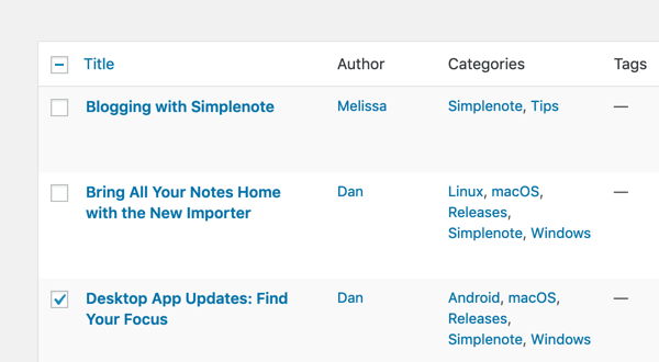
- CheckboxControl 适用于用户需要从列表中选择多个项目或打开包含子选项列表的场景。
- 支持父子复选框关系,父复选框状态可控制子复选框,部分选中时父复选框显示为混合状态。
- 组件接受 label、help、checked、onChange、indeterminate 等 props,其中 onChange 为必需。
- 相关组件包括 RadioControl(单选)和 FormToggle(开关切换)。
代码示例
import { useState } from 'react';
import { CheckboxControl } from '@wordpress/components';

const MyCheckboxControl = () => {
    const [ isChecked, setChecked ] = useState( true );
    return (
        <CheckboxControl
            label="Is author"
            help="Is the user a author or not?"
            checked={ isChecked }
            onChange={ setChecked }
        />
    );
};Checkboxes allow the user to select one or more items from a set.

Design guidelines
Usage
When to use checkboxes
Use checkboxes when you want users to:
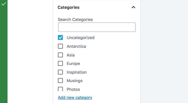
- Select one or multiple items from a list.
- Open a list containing sub-selections.
Do
Use checkboxes when users can select multiple items from a list. They let users select more than one item.
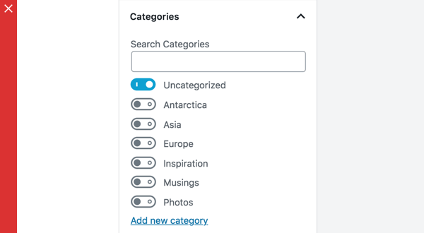
Don’t
Don’t use toggles when a list consists of multiple options. Use checkboxes — they take up less space.
Checkboxes can be used to open a list containing sub-selections.
Parent and child checkboxes
Checkboxes can have a parent-child relationship, with secondary options nested under primary options.
When the parent checkbox is checked, all the child checkboxes are checked. When a parent checkbox is unchecked, all the child checkboxes are unchecked.
If only a few child checkboxes are checked, the parent checkbox becomes a mixed checkbox.
Development guidelines
Usage
Render an is author checkbox:
import { useState } from 'react';
import { CheckboxControl } from '@wordpress/components';

const MyCheckboxControl = () => {
    const [ isChecked, setChecked ] = useState( true );
    return (
        <CheckboxControl
            label="Is author"
            help="Is the user a author or not?"
            checked={ isChecked }
            onChange={ setChecked }
        />
    );
};
Props
The set of props accepted by the component will be specified below.
Props not included in this set will be applied to the input element.
label: string
A label for the input field, that appears at the side of the checkbox.
The prop will be rendered as content a label element.
If no prop is passed an empty label is rendered.
- Required: No
help: string|Element
If this property is added, a help text will be generated using help property as the content.
- Required: No
checked: boolean
If checked is true the checkbox will be checked. If checked is false the checkbox will be unchecked.
If no value is passed the checkbox will be unchecked.
- Required: No
onChange: function
A function that receives the checked state (boolean) as input.
- Required: Yes
indeterminate: boolean
If indeterminate is true the state of the checkbox will be indeterminate.
- Required: No
Related components
- To select one option from a set, and you want to show all the available options at once, use the
RadioControlcomponent. - To toggle a single setting on or off, use the
FormTogglecomponent.