Notice
概述
Notice 组件用于向用户显示重要的非模态消息,支持多种状态和交互选项。它位于屏幕顶部,可持久显示,用户可选择忽略或关闭。
关键要点
- Notice 用于传达中等重要性的消息,不要求立即操作,比 Modal 干扰性小。
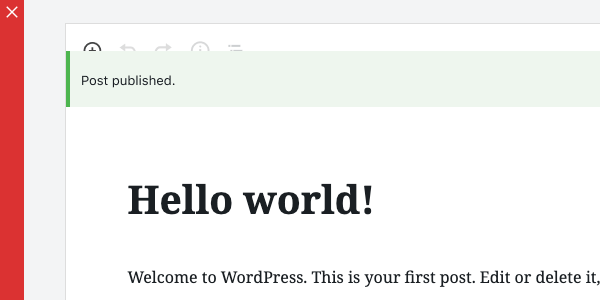
- 消息类型通过颜色区分:信息(蓝色/主题色)、成功(绿色)、警告(黄色)、错误(红色)。
- 支持可关闭、自定义语音消息、操作按钮等高级功能。
- 开发时需注意 props 如 status、onRemove、actions 的用法,避免使用已弃用的 onDismiss。
代码示例
import { Notice } from '@wordpress/components';

const MyNotice = () => (
    <Notice status="error">An unknown error occurred.</Notice>
);
注意事项
- 不要将 Notice 用于需要立即关注和操作的消息,应使用 Modal。
- 确保 Notice 显示在工具栏下方,而非覆盖其上。
- 仅使用预定义的颜色编码,避免自定义其他颜色。
Use Notices to communicate prominent messages to the user.
Design guidelines
A Notice displays a succinct message. It can also offer the user options, like viewing a published post or updating a setting, and requires a user action to be dismissed.
Use Notices to communicate things that are important but don’t necessarily require action — a user can keep using the product even if they don’t choose to act on a Notice. They are less interruptive than a Modal.
Usage
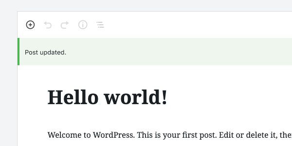
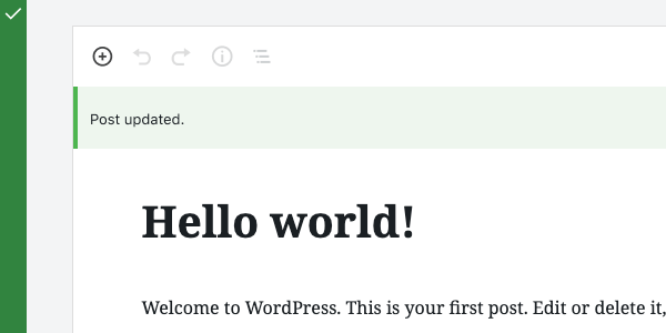
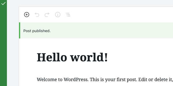
Notices display at the top of the screen, below any toolbars anchored to the top of the page. They’re persistent and non-modal. Since they don’t overlay the content, users can ignore or dismiss them, and choose when to interact with them.
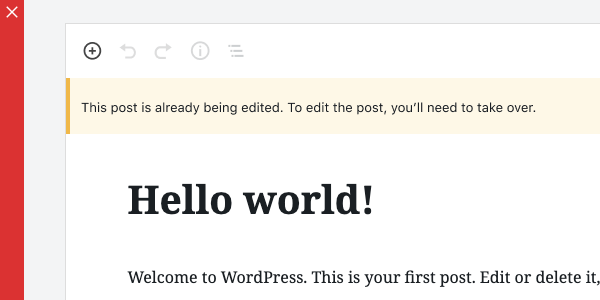
Notices are color-coded to indicate the type of message being communicated:
- Informational notices are blue by default.
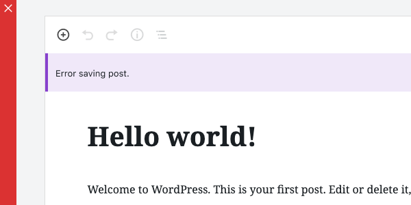
- If there is a parent
Themecomponent with anaccentcolor prop, informational notices will take on that color instead. - Success notices are green.
- Warning notices are yellow.
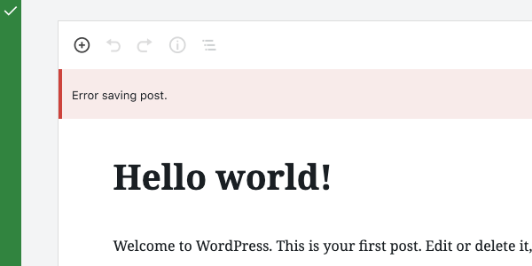
- Error notices are red.
If an icon is included in the Notice, it should be color-coded to match the Notice state.
Do’s and Don’ts
Do use a Notice when you want to communicate a message of medium importance.
Don’t use a Notice for a message that requires immediate attention and action from the user. Use a Modal for this instead.
Do display Notices at the top of the screen, below any toolbars.
Don’t show Notices on top of toolbars.
Do use color to indicate the type of message being communicated.
Don’t apply any colors other than those for Warnings, Success, or Errors.
Development guidelines
Usage
To display a plain notice, pass Notice a string:
import { Notice } from '@wordpress/components';

const MyNotice = () => (
    <Notice status="error">An unknown error occurred.</Notice>
);
For more complex markup, you can pass any JSX element:
import { Notice } from '@wordpress/components';

const MyNotice = () => (
    <Notice status="error">
        <p>
            An error occurred: <code>{ errorDetails }</code>.
        </p>
    </Notice>
);
Props
The following props are used to control the behavior of the component.
children: ReactNode
The displayed message of a notice. Also used as the spoken message for assistive technology, unless spokenMessage is provided as an alternative message.
- Required: Yes
spokenMessage: ReactNode
Used to provide a custom spoken message in place of the children default.
- Required: No
- Default:
children
status: 'warning' | 'success' | 'error' | 'info'
Determines the color of the notice: warning (yellow), success (green), error (red), or 'info'. By default 'info' will be blue, but if there is a parent Theme component with an accent color prop, the notice will take on that color instead.
- Required: No
- Default:
info
onRemove: () => void
A function called to dismiss/remove the notice.
- Required: No
- Default:
noop
politeness: 'polite' | 'assertive'
A politeness level for the notice’s spoken message. Should be provided as one of the valid options for an aria-live attribute value.
- A value of
'assertive'is to be used for important, and usually time-sensitive, information. It will interrupt anything else the screen reader is announcing in that moment. - A value of
'polite'is to be used for advisory information. It should not interrupt what the screen reader is announcing in that moment (the “speech queue”) or interrupt the current task.
Note that this value should be considered a suggestion; assistive technologies may override it based on internal heuristics.
- Required: No
- Default:
'assertive'or'polite', based on the notice status.
isDismissible: boolean
Whether the notice should be dismissible or not
- Required: No
- Default:
true
onDismiss : () => void
A deprecated alternative to onRemove. This prop is kept for compatibility reasons but should be avoided.
- Required: No
- Default:
noop
actions: Array<NoticeAction>.
An array of notice actions. Each member object should contain:
label:stringcontaining the text of the button/linkurl:string(optional) The href URL for the action button. If provided, the action will render as an anchor tag.onClick:( event: SyntheticEvent ) => void(optional) Function to call when clicked. Can be used alongsideurl.disabled:boolean(optional) Whether the action button is disabled.className:string(optional) to add custom classes to the button styles.noDefaultClasses:boolean(optional) A value oftruewill remove all default styling.variant:'primary' | 'secondary' | 'link'(optional) You can denote a primary button action for a notice by passing a value ofprimary.
The default variant of an action button is 'secondary' if only onClick is provided, or 'link' if url is provided.
Related components
- To create a more prominent message that requires action, use a Modal.
- For low priority, non-interruptive messages, use Snackbar.