TextareaControl
概述
TextareaControl 是 WordPress 组件库中的一个多行文本输入控件,适用于需要用户输入较长文本的场景。它提供固定高度和垂直滚动功能,并遵循设计指南以确保良好的用户体验。
关键要点
- TextareaControl 用于鼓励用户输入超过单行长度的文本,如描述或评论。
- 设计上应突出显示、区分状态、提供清晰标签和错误提示。
- 避免用于短文本输入(如姓名或电话号码),此时应使用 TextControl。
- 包含容器、标签和错误文本等解剖结构,以增强可发现性和可用性。
- 开发时需导入 @wordpress/components 包,并通过 props 如 label、value、onChange 进行配置。
代码示例
import { useState } from 'react';
import { TextareaControl } from '@wordpress/components';

const MyTextareaControl = () => {
    const [ text, setText ] = useState( '' );

    return (
        <TextareaControl
            label="Text"
            help="Enter some text"
            value={ text }
            onChange={ ( value ) => setText( value ) }
        />
    );
};
注意事项
- props 如 help、hideLabelFromVision、label、onChange、rows、value 需按需设置,其中 onChange 和 value 为必填。
- 未列出的 props 将直接应用于 textarea 元素。
- 对于单行文本输入,推荐使用 TextControl 组件。
TextareaControls are TextControls that allow for multiple lines of text, and wrap overflow text onto a new line. They are a fixed height and scroll vertically when the cursor reaches the bottom of the field.
Design guidelines
Usage
When to use TextareaControl
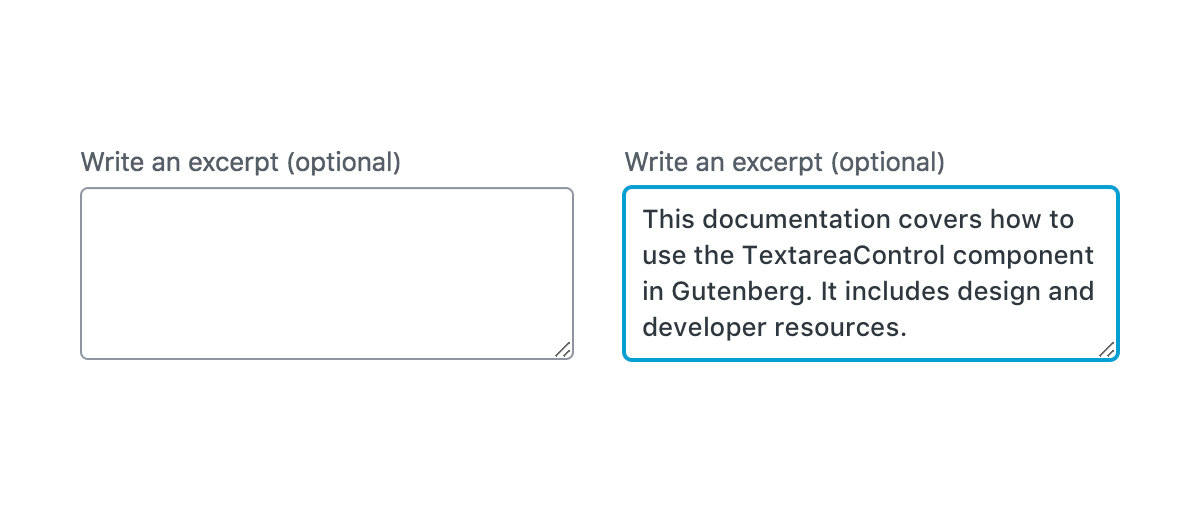
Use TextareaControl when you need to encourage users enter an amount of text that’s longer than a single line. (A bigger box can encourage people to be more verbose, where a smaller one encourages them to be succinct.)
TextareaControl should:
- Stand out from the background of the page and indicate that users can input information.
- Have clearly differentiated active/inactive states, including focus styling.
- Make it easy to understand and address any errors via clear and direct error notices.
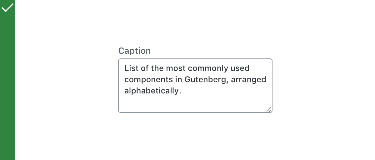
- Make it easy to understand the requested information by using a clear and descriptive label.
When not to use TextareaControl
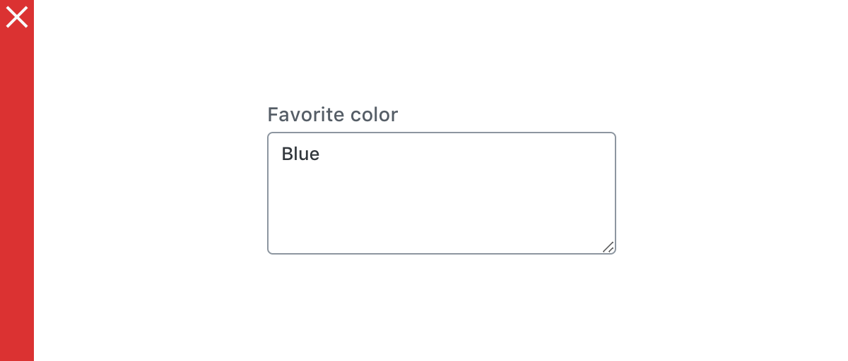
Do not use TextareaControl if you need to let users enter shorter answers (no longer than a single line), such as a phone number or name. In this case, you should use Text Control.
Do
Use TextareaControl to let users to enter text longer than a single line.
Don’t
Use TextareaControl for shorter answers.
Anatomy
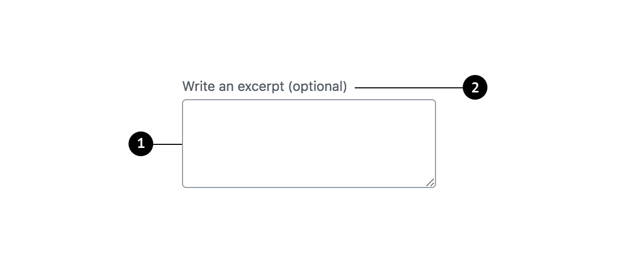
- Container
- Label
Containers
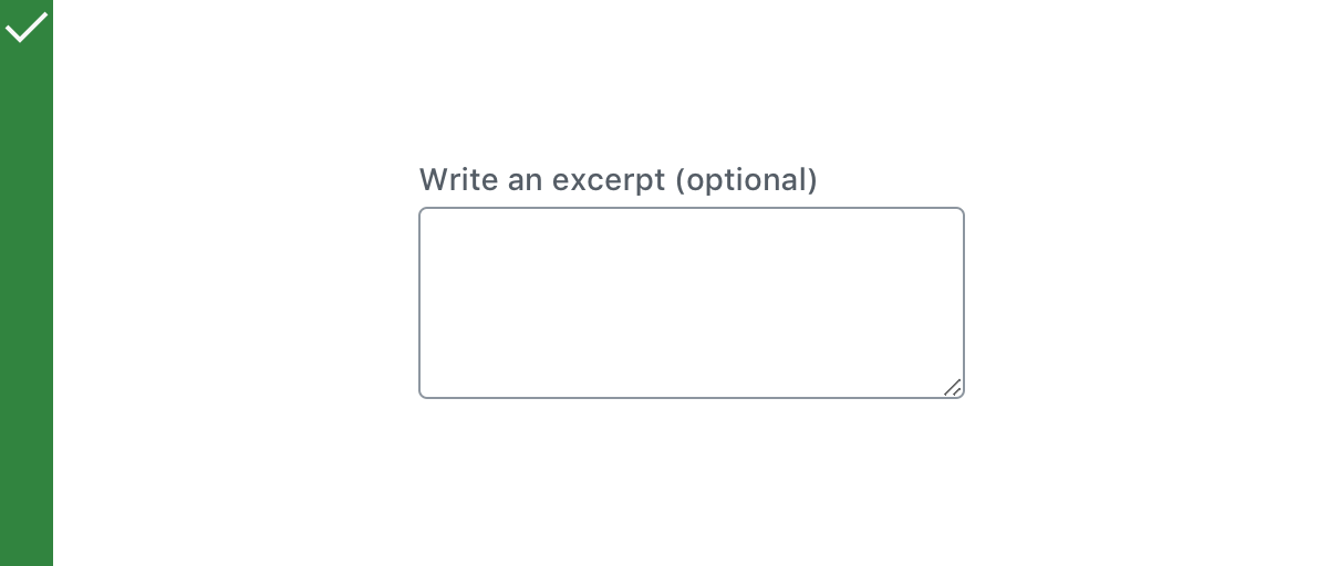
Containers improve the discoverability of text fields by creating contrast between the text field and surrounding content.
Do
Use a stroke around the container, which clearly indicates that users can input information.
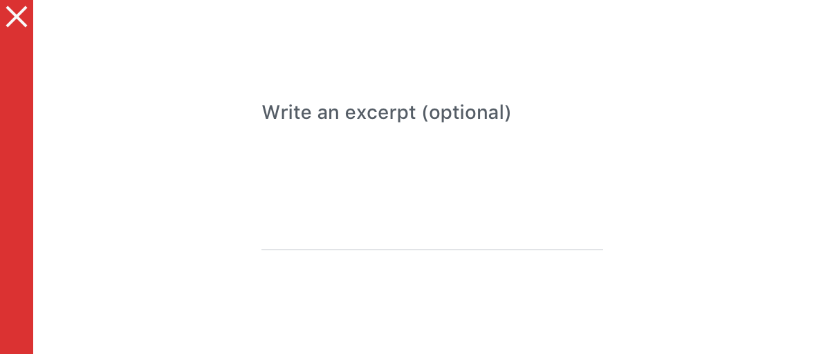
Don’t
Use unclear visual markers to indicate a text field.
Label text
Label text is used to inform users as to what information is requested for a text field. Every text field should have a label. Label text should be above the input field, and always visible. Write labels in sentence capitalization.
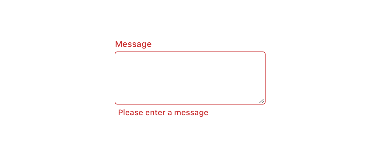
Error text
When text input isn’t accepted, an error message can display instructions on how to fix it. Error messages are displayed below the input line, replacing helper text until fixed.
Development guidelines
Usage
import { useState } from 'react';
import { TextareaControl } from '@wordpress/components';

const MyTextareaControl = () => {
    const [ text, setText ] = useState( '' );

    return (
        <TextareaControl
            label="Text"
            help="Enter some text"
            value={ text }
            onChange={ ( value ) => setText( value ) }
        />
    );
};
Props
The set of props accepted by the component will be specified below.
Props not included in this set will be applied to the textarea element.
help: string | Element
If this property is added, a help text will be generated using help property as the content.
- Required: No
hideLabelFromVision: boolean
If true, the label will only be visible to screen readers.
- Required: No
label: string
If this property is added, a label will be generated using label property as the content.
- Required: No
onChange: ( value: string ) => void
A function that receives the new value of the textarea each time it changes.
- Required: Yes
rows: number
The number of rows the textarea should contain.
- Required: No
- Default: 4
value: string
The current value of the textarea.
- Required: Yes
Related components
- For a field where users only enter one line of text, use the
TextControlcomponent.