Modal
概述
Modal 是一种用于在用户界面中显示关键信息或请求决策的浮动窗口组件,它会暂时禁用其他功能,直到用户确认或关闭。本文档提供了 Modal 的设计原则、使用场景、结构、行为规范以及开发指南,帮助 WordPress 开发者正确实现可访问的模态对话框。
关键要点
- Modal 用于显示错误、关键信息或上下文信息,应谨慎使用以避免中断用户操作。
- 设计原则包括聚焦性、直接性和帮助性,确保内容清晰且相关。
- Modal 结构包括容器、标题、支持文本、按钮、遮罩和可选关闭按钮。
- 行为规范涉及位置、滚动和关闭方式,如点击外部、取消按钮或按 Esc 键。
- 开发指南基于 React 组件,提供使用示例和详细 Props 说明,如 title、onRequestClose、isDismissible 等。
- 相关组件包括 Notice,用于中等重要性的消息通知。
代码示例
import { useState } from 'react';
import { Button, Modal } from '@wordpress/components';

const MyModal = () => {
    const [ isOpen, setOpen ] = useState( false );
    const openModal = () => setOpen( true );
    const closeModal = () => setOpen( false );

    return (
        <>
            <Button variant="secondary" onClick={ openModal }>
                Open Modal
            </Button>
            { isOpen && (
                <Modal title="This is my modal" onRequestClose={ closeModal }>
                    <Button variant="secondary" onClick={ closeModal }>
                        My custom close button
                    </Button>
                </Modal>
            ) }
        </>
    );
};
注意事项
- Modal 应避免过度使用,仅在必要时中断用户任务。
- 标题对于可访问性至关重要,可通过 title、contentLabel 或 aria.labelledby 提供。
- 关闭逻辑必须正确实现,确保 Modal 能通过多种方式(如点击外部、取消按钮、Esc 键)关闭。
- 实验性属性如 __experimentalHideHeader 可能发生重大变更,使用时需谨慎。
Modals give users information and choices related to a task they’re trying to accomplish. They can contain critical information, require decisions, or involve multiple tasks.
Design guidelines
Usage
A modal is a type of floating window that appears in front of content to provide critical information or ask for a decision. Modals disable all other functionality when they appear. A modal remains on screen until the user confirms it, dismisses it, or takes the required action.
While modals can be an effective way to disclose additional controls or information, they can also be a source of interruption for the user. For this reason, always question whether a modal is necessary, and work to avoid the situations in which they are required.
Principles
- Focused. Modals pull user attention away from the rest of the screen to focus their attention, ensuring that the modal’s content is addressed.
- Direct. Modal text should communicate important information and be dedicated to helping the user appropriately complete a task.
- Helpful. Modals should appear in response to a user task or an action to offer relevant and contextual information.
When to use
Modals are used for:
- Errors that block normal operation.
- Critical information that requires a specific user task, decision, or acknowledgement.
- Contextual information that appears in response to a user task or action.
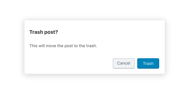
Anatomy
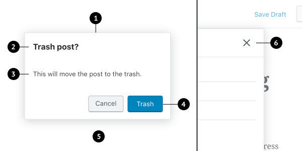
- Container
- Title
- Supporting text
- Buttons
- Scrim
- Close button (optional)
Modal box and scrim
A modal is a type of window. Access to the rest of the UI is disabled until the modal is addressed. All modals are interruptive by design – their purpose is to have the user focus on content, so the modal surface appears in front of all other surfaces.
To clarify that the rest of the screen is inaccessible and to focus attention on the modal, surfaces behind the modal are scrimmed — they get a temporary overlay to obscure their content and make it less prominent.
Title
A modal’s purpose is communicated through its title and button text.
All modals should have a title for accessibility reasons (the contentLabel prop can be used to set titles that aren’t visible).
Titles should:
- Contain a brief, clear statement or question
- Avoid apologies (“Sorry for the interruption”), alarm (“Warning!”), or ambiguity (“Are you sure?”).
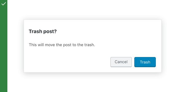
Do
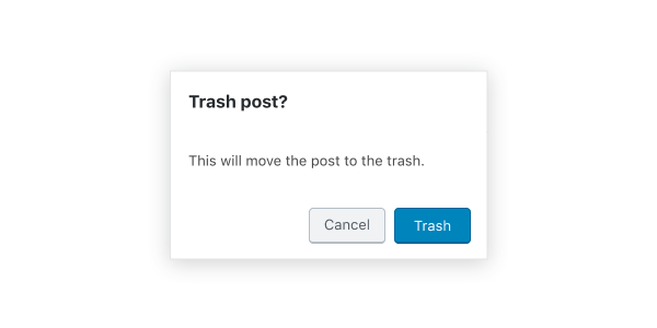
This modal title poses a specific question, concisely explains the purpose the request, and provides clear actions.
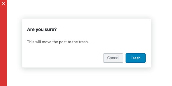
Don’t
This modal creates ambiguity, and therefore unease — it leaves the user unsure about how to respond, or causes them to second-guess their answer.
Buttons
Side-by-side buttons (recommended)
Side-by-side buttons display two text buttons next to one another.
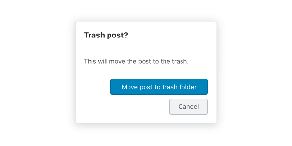
Stacked or full-width buttons
Use stacked buttons when you need to accommodate longer button text. Always place confirming actions above dismissive actions.
Behavior
Modals appear without warning, requiring users to stop their current task. They should be used sparingly — not every choice or setting warrants this kind of abrupt interruption.
Position
Modals retain focus until dismissed or the user completes an action, like choosing a setting. They shouldn’t be obscured by other elements or appear partially on screen.
Scrolling
Most modal content should avoid scrolling. Scrolling is permissible if the modal content exceeds the height of the modal (e.g. a list component with many rows). When a modal scrolls, the modal title is pinned at the top and the buttons are pinned at the bottom. This ensures that content remains visible alongside the title and buttons, even while scrolling.
Modals don’t scroll with elements outside of the modal, like the background.
When viewing a scrollable list of options, the modal title and buttons remain fixed.
Dismissing modals
Modals are dismissible in three ways:
- Tapping outside of the modal
- Tapping the “Cancel” button
- Tapping the “Close” icon button, or pressing the
esckey
If the user’s ability to dismiss a modal is disabled, they must choose a modal action to proceed.
Development guidelines
The modal is used to create an accessible modal over an application.
Note: The API for this modal has been mimicked to resemble react-modal.
Usage
The following example shows you how to properly implement a modal. For the modal to properly work it’s important you implement the close logic for the modal properly.
import { useState } from 'react';
import { Button, Modal } from '@wordpress/components';

const MyModal = () => {
    const [ isOpen, setOpen ] = useState( false );
    const openModal = () => setOpen( true );
    const closeModal = () => setOpen( false );

    return (
        <>
            <Button variant="secondary" onClick={ openModal }>
                Open Modal
            </Button>
            { isOpen && (
                <Modal title="This is my modal" onRequestClose={ closeModal }>
                    <Button variant="secondary" onClick={ closeModal }>
                        My custom close button
                    </Button>
                </Modal>
            ) }
        </>
    );
};
Props
The set of props accepted by the component will be specified below.
Props not included in this set will be applied to the input elements.
aria.describedby: string
If this property is added, it will be added to the modal content div as aria-describedby.
- Required: No
aria.labelledby: string
If this property is added, it will be added to the modal content div as aria-labelledby.
Use this when you are rendering the title yourself within the modal’s content area instead of using the title prop. This ensures the title is usable by assistive technology.
Titles are required for accessibility reasons, see contentLabel and title for other ways to provide a title.
- Required: No
- Default: if the
titleprop is provided, this will default to the id of the element that renderstitle
bodyOpenClassName: string
Class name added to the body element when the modal is open.
- Required: No
- Default:
modal-open
className: string
If this property is added, it will an additional class name to the modal content div.
- Required: No
contentLabel: string
If this property is added, it will be added to the modal content div as aria-label.
Titles are required for accessibility reasons, see aria.labelledby and title for other ways to provide a title.
- Required: No
focusOnMount: boolean | 'firstElement' | ‘firstContentElement’
If this property is true, it will focus the first tabbable element rendered in the modal.
If this property is false, focus will not be transferred and it is the responsibility of the consumer to ensure accessible focus management.
If set to firstElement focus will be placed on the first tabbable element anywhere within the Modal.
If set to firstContentElement focus will be placed on the first tabbable element within the Modal’s content (i.e. children). Note that it is the responsibility of the consumer to ensure there is at least one tabbable element within the children or the focus will be lost.
- Required: No
- Default:
true
headerActions
An optional React node intended to contain additional actions or other elements related to the modal, for example, buttons. Content is rendered in the top right corner of the modal and to the left of the close button, if visible.
- Required: No
- Default:
null
isDismissible: boolean
If this property is set to false, the modal will not display a close icon and cannot be dismissed.
- Required: No
- Default:
true
isFullScreen: boolean
This property when set to true will render a full screen modal.
- Required: No
- Default:
false
size: 'small' | 'medium' | 'large' | 'fill'
If this property is added it will cause the modal to render at a preset width, or expand to fill the screen. This prop will be ignored if isFullScreen is set to true.
- Required: No
Note: Modal‘s width can also be controlled by adjusting the width of the modal’s contents via CSS.
onRequestClose: “
This function is called to indicate that the modal should be closed.
- Required: Yes
overlayClassName: string
If this property is added, it will an additional class name to the modal overlay div.
- Required: No
role: AriaRole
If this property is added, it will override the default role of the modal.
- Required: No
- Default:
dialog
shouldCloseOnClickOutside: boolean
If this property is added, it will determine whether the modal requests to close when a mouse click occurs outside of the modal content.
- Required: No
- Default:
true
shouldCloseOnEsc: boolean
If this property is added, it will determine whether the modal requests to close when the escape key is pressed.
- Required: No
- Default:
true
style: CSSProperties
If this property is added, it will be added to the modal frame div.
- Required: No
title: string
This property is used as the modal header’s title.
Titles are required for accessibility reasons, see aria.labelledby and contentLabel for other ways to provide a title.
- Required: No
__experimentalHideHeader: boolean
When set to true, the Modal’s header (including the icon, title and close button) will not be rendered.
Warning: This property is still experimental. “Experimental” means this is an early implementation subject to drastic and breaking changes.
- Required: No
- Default:
false
Related components
- To notify a user with a message of medium importance, use
Notice.