Spacing
概述
本文档详细介绍了 WordPress 主题开发中通过 theme.json 配置间距设置的方法。核心内容包括 settings.spacing 属性的各项配置选项,如 blockGap、margin、padding、spacingScale 和 spacingSizes,用于控制块间距、边距、内边距及自定义间距预设。
关键要点
- settings.spacing 属性用于配置间距相关设置,包括 blockGap、margin、padding、customSpacingSize、spacingScale、spacingSizes 和 units。
- blockGap 控制块间距的启用与禁用,可设置为 true、false 或 null,null 会禁用用户界面和 WordPress 生成的 CSS。
- margin 和 padding 设置默认禁用,通过设置为 true 可在支持的块中启用边距和内边距控制。
- customSpacingSize 设置为 false 可限制用户使用自定义间距值,强制使用主题预设的间距尺寸。
- units 数组定义允许的 CSS 单位,如 px、em、rem、vh、vw、% 等,用于自定义间距输入。
- spacingScale 允许定义自定义间距比例,通过 operator、increment、steps、mediumStep 和 unit 子设置配置。
- spacingSizes 提供完全自定义的间距尺寸数组,每个尺寸包括 name、size 和 slug,支持流体尺寸如 clamp()。
- 间距预设作为 CSS 自定义属性生成,可用于 Block Spacing、Margin 和 Padding 控制,确保设计一致性。
代码示例
{
  "version": 2,
  "settings": {
    "spacing": {
      "blockGap": true,
      "margin": true,
      "padding": true,
      "customSpacingSize": false,
      "units": [ "px", "em", "rem", "vh", "vw", "%" ],
      "spacingScale": {
        "operator": "+",
        "increment": 0.25,
        "steps": 7,
        "mediumStep": 1,
        "unit": "rem"
      },
      "spacingSizes": [
        {
          "name": "Step 1",
          "size": "0.25rem",
          "slug": "10"
        }
      ]
    }
  }
}
注意事项
- blockGap 设置为 null 会禁用 WordPress 生成的块间距 CSS,通常不推荐,除非需要手动处理 CSS。
- spacingScale 和 spacingSizes 可混合使用,但建议选择一种方法以简化配置。
- 间距预设超过七个时,界面会从范围滑块切换为下拉选择。
- 流体尺寸必须通过 spacingSizes 方法定义,支持 clamp()、min()、max() 等 CSS 函数。
- 确保配置的 CSS 单位在 WordPress 允许的列表中,当前版本支持 px、%、em、rem、vw、vh、vmin、vmax、ch、ex、cm、mm、in、pc、pt。
Spacing is one of the most complex parts of web design. It involves combining things like margin, padding, gap, line height, font size, and more into a harmonious flow. Doing this well requires a keen eye and a foundational understanding of how each of these pieces come together.
The settings.spacing property in theme.json covers settings related specifically to margin, padding, and gap.
This handbook also has documentation for typography settings and applying styles to blocks, both of which play roles in wrangling the spacing for your overall design.
Spacing settings
The settings.spacing object has several properties that you can configure:
blockGap: Whether to enable the Block Spacing option for blocks that support it. Can be a boolean value (true/false). Defaults tonull. If set to null, WordPress’ generated CSS is also disabled.margin: Whether to enable the Margin option for supported blocks. Defaults tofalse.padding: Whether to enable the Padding option for supported blocks. Defaults tofalse.customSpacingSize: Whether to allow users to input custom spacing values for supported blocks. Defaults totrue.spacingScale: A configuration object for defining a custom spacing scale. WordPress defines a default scale with seven steps that increment by1.5rem.spacingSizes: An array of custom size objects that may overrule the spacing scale or add to it.units: An array of possible CSS units that users can select from when adding custom spacing.
Here is what spacing settings look like the default WordPress theme.json:
{
	"version": 2,
	"settings": {
		"spacing": {
			"blockGap": null,
			"customSpacingSize": true,
			"margin": false,
			"padding": false,
			"spacingScale": {
				"operator": "*",
				"increment": 1.5,
				"steps": 7,
				"mediumStep": 1.5,
				"unit": "rem"
			},
			"spacingSizes": [],
			"units": [ "px", "em", "rem", "vh", "vw", "%" ]
		}
	}
}
Enabling or disabling spacing options
As noted in the default settings in the previous section, there are several settings that are merely for enabling or disabling elements in the user interface. In this section, you will learn how to configure each of these.
Enabling block spacing (block gap)
In WordPress, the “block gap” refers to the spacing between blocks on a page. In most cases, this is the vertical spacing between blocks. But it can also refer to horizontal spacing when blocks are set in horizontal flex or in a grid layout.
In flow layouts (the default), the block gap is applied using the CSS margin-top property to sibling elements. In flex or grid layouts, it is applied using the CSS gap property.
WordPress will automatically output the CSS for the block gap if this setting is not disabled entirely (the default).
You will learn more about defining block gap styles in the Styles documentation, but having a baseline understanding of the terminology should help you decide how to work with this option.
The primary purpose of the settings.spacing.blockGap is to enable or disable the user interface for the Block Spacing control for blocks that support it. You can do this by setting it to true or false.
However, you can also leave it as null (the default value). This disables the user interface. In addition, it removes the WordPress-generated block spacing CSS.
Leaving this to the default null value is not usually recommended except in special cases. Generally, you would want consistent spacing as part of your design’s vertical rhythm. If set to null, you will need to handle that manually via custom CSS.
Use this table as a reference when determining which value to assign to settings.spacing.blockGap:
blockGap Value |
Block Spacing Control | WordPress-generated CSS |
|---|---|---|
null |
No | No |
true |
Yes | Yes |
false |
No | Yes |
Now try configuring the setting. Open your theme.json file and set the property to true:
{
	"version": 2,
	"settings": {
		"spacing": {
			"blockGap": true
		}
	}
}
For blocks that support the property, you should now see the Block Spacing control appear. Here is a screenshot of what that looks like on the Post Template block:
Because of the way the layout system works in WordPress, it will output CSS that is specific to individual containers to handle the gap between blocks nested within those containers. For the screenshot example, here’s what that CSS looks like:
.wp-container-17.wp-container-17 > :first-child:first-child {
	margin-block-start: 0;
}

.wp-container-17.wp-container-17 > * {
	margin-block-start: var(--wp--preset--spacing--plus-4);
	margin-block-end: 0;
}
Of course, the ID (17) and value will be different on a case-by-case basis.
Enabling margin and padding
The margin and padding settings are a little more straightforward. They are both disabled by default, and you can enable them by setting their values to true in theme.json:
{
	"version": 2,
	"settings": {
		"spacing": {
			"margin": true,
			"padding": true
		}
	}
}
This will make the Margin and Padding controls appear for supported blocks in their inspector controls in the sidebar:
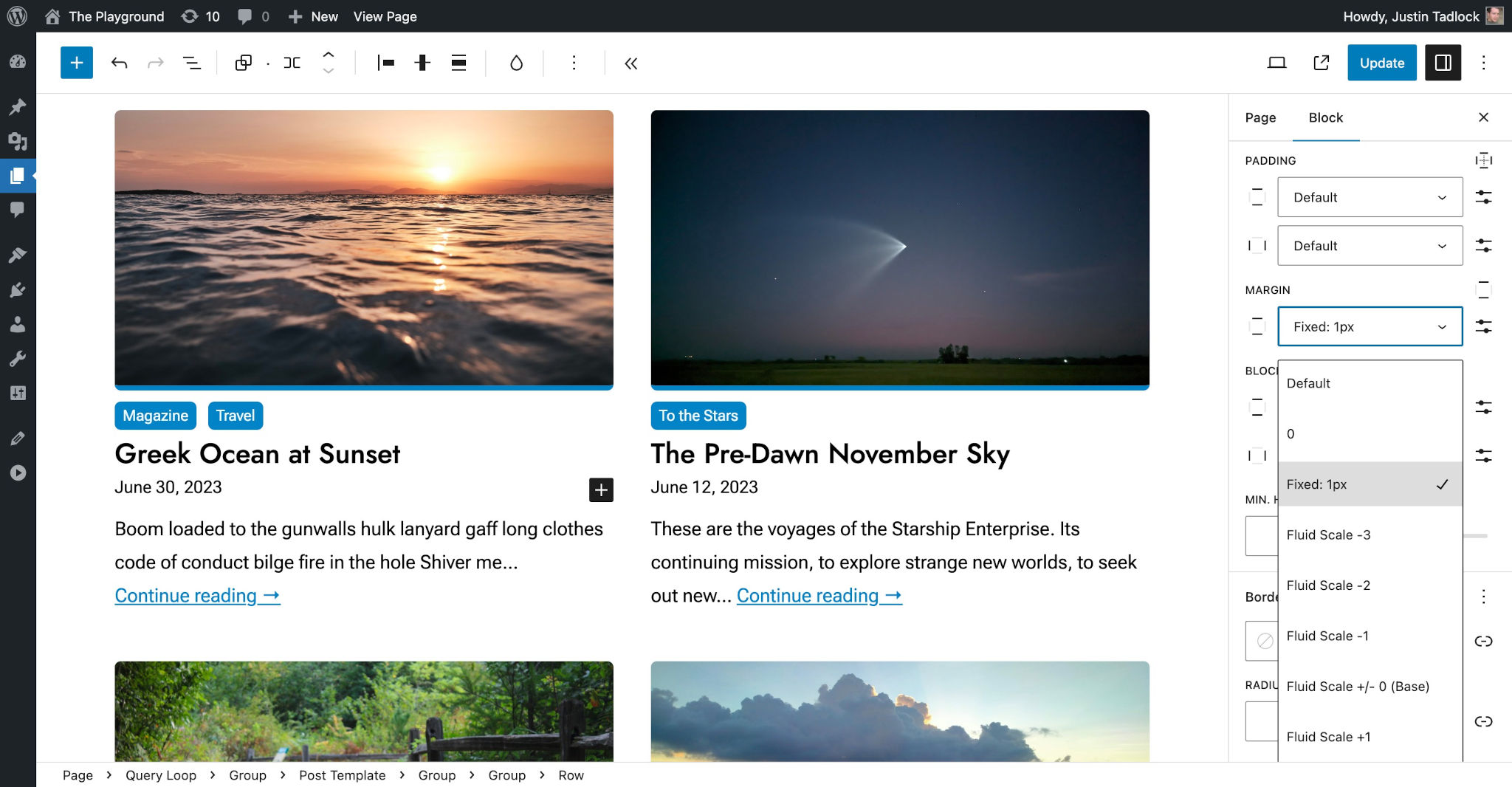
Of course, you are free to leave both of these to the default value of false or configure them to your liking.
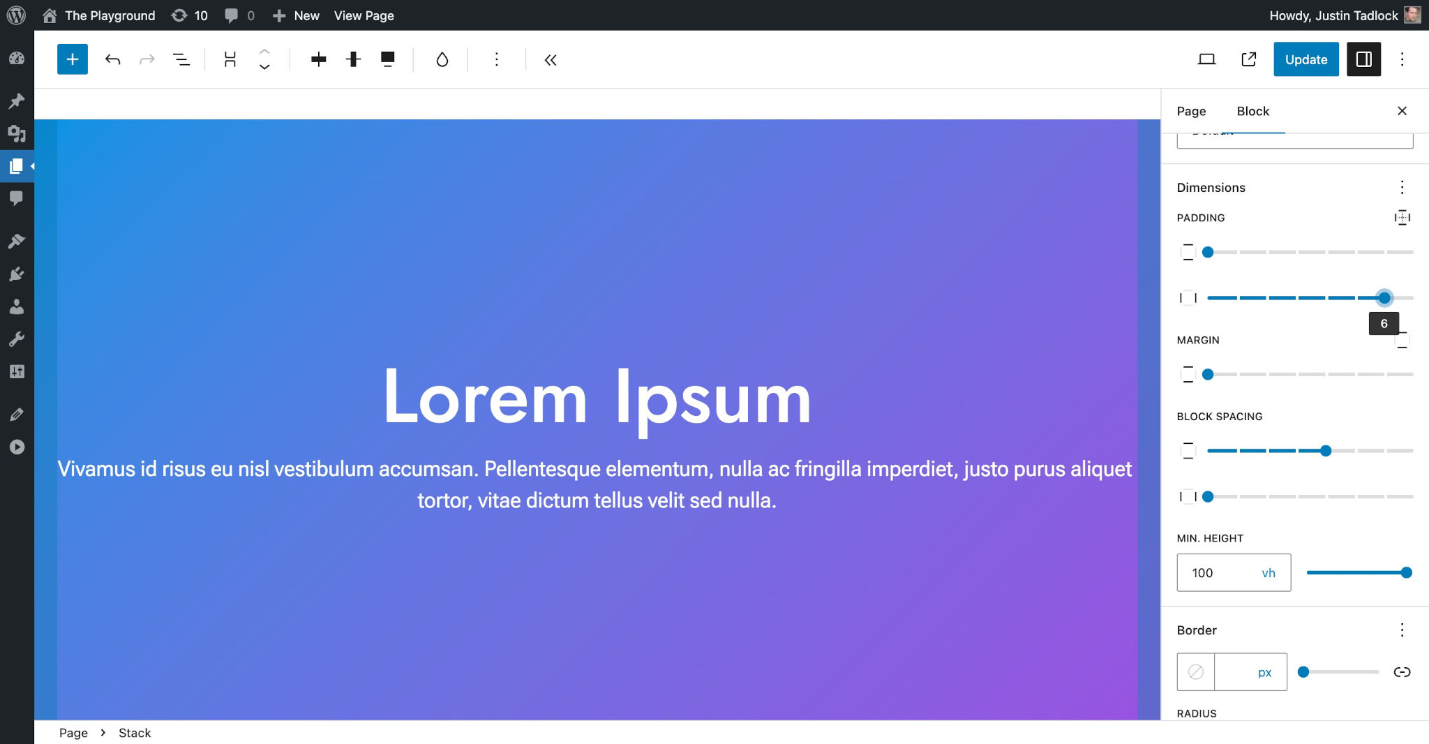
Disabling user-defined spacing sizes
When any one of the blockGap, margin, or padding spacing settings are enabled, WordPress will output a user interface for setting those values for blocks that support them. By default, users can select from a list of preset spacing sizes (see “Spacing scale and sizes” below) or input a custom value.
In this screenshot, you can see that there is a custom Block Spacing setting chosen for the Buttons block:

You may want to limit users to your predefined spacing scale or sizes for your theme. This is often a good idea if you want to ensure consistent spacing throughout your design.
To do this, you must set the customSpacingSizes setting to false. This disables the custom spacing option in the editor UI but leaves the control for the theme’s defined sizes available:
{
	"version": 2,
	"settings": {
		"spacing": {
			"customSpacingSize": false
		}
	}
}
With custom spacing sizes disabled, the Block Spacing option from the Buttons block example will be limited to the theme’s preset sizes:

Defining allowed spacing units
If you choose to enable the settings.spacing.customSpaceSize option covered in the previous section, you will need to make another choice: which CSS unit values will your theme allow?
By default, WordPress lets users select from a subset of possible CSS units (there are dozens in the CSS specification). To choose which units you want to support, you must add them into the settings.spacing.units array in theme.json (shown with the defaults):
{
	"version": 2,
	"settings": {
		"spacing": {
			"units": [ "px", "em", "rem", "vh", "vw", "%" ]
		}
	}
}
The currently-allowed possible units that you can choose from are:
px%emremvwvhvminvmaxchexcmmminpcpt
As of WordPress 6.3, the allowed units are limited to the above list. There is an open ticket to expand these to support more modern units.
Spacing scale and sizes
One of the most important things that you should configure in your theme.json file is your spacing presets. WordPress will generate these presets as CSS custom properties, loading them in the editor and front end.
Most designers will use some type of standard scaling system for handling spacing, and WordPress gives you the flexibility to use whatever system you choose.
There are two methods for registering your spacing presets:
spacingScale: A generated scale based on your configuration values.spacingSizes: Completely custom-defined spacing sizes.
Technically, you can use both of these methods, mixing and matching them. But it is generally recommended to choose one over the other for simplicity.
Spacing presets appear as choices for the Block Spacing, Margin, and Padding block controls (for blocks that support them). This means that you can present users with spacing options that are specific to your theme. You can also use these presets in the Styles section in your theme.json or custom CSS.
WordPress generates a default spacing scale, as shown in this table:
| CSS Custom Property | CSS Value | Label |
|---|---|---|
--wp-preset--spacing--20 |
0.44rem |
2X-Small |
--wp-preset--spacing--30 |
0.67rem |
X-Small |
--wp-preset--spacing--40 |
1rem |
Small |
--wp-preset--spacing--50 |
1.5rem |
Medium |
--wp-preset--spacing--60 |
2.25rem |
Large |
--wp-preset--spacing--70 |
3.38rem |
X-Large |
--wp-preset--spacing--80 |
5.06rem |
2X-Large |
It is unlikely that this scale matches your design. So you will want to choose a method for overriding these default values.
Custom spacing scale
WordPress allows theme authors to create a custom spacing scale by providing a set of configuration instructions. Each step in the scale generates a custom CSS property with the slug of --wp--preset--spacing--{step} (steps appear in increments of 10, regardless of their value).
The spacingScale object has five sub-settings that themes can configure:
operator: The operator used to increment the scale. The available options are+(addition) and*(multiplication). The default value is*.increment: A number in which to increment the scale by when used in conjunction with theoperatorsetting. The default value is1.5.steps: The total number of steps in the scale. The default value is7.mediumStep: The medium value of the scale. The default value is1.5.unit: A valid CSS spacing unit. The available options arepx,em,rem,vh,vw, and%. The default value isrem.
The following example is a custom scale with seven steps that increments by 0.25rem:
{
	"version": 2,
	"settings": {
		"spacing": {
			"spacingScale": {
				"operator": "+",
				"increment": 0.25,
				"steps": 7,
				"mediumStep": 1,
				"unit": "rem"
			}
		}
	}
}
As shown in the screenshot, you should see a range slider the Padding, Margin, and Block Spacing controls for setting your registered values:
When there are seven or fewer spacing presets, the interface will show a range slider for spacing controls. But more than seven displays a dropdown select. This applies to both the spacingScale method used here and the spacingSizes method in the next section.
This table represents your custom spacing scale (compare to the default scale to see how things have changed):
| CSS Custom Property | CSS Value | Label |
|---|---|---|
--wp-preset--spacing--20 |
0.25rem |
2X-Small |
--wp-preset--spacing--30 |
0.5rem |
X-Small |
--wp-preset--spacing--40 |
0.75rem |
Small |
--wp-preset--spacing--50 |
1rem |
Medium |
--wp-preset--spacing--60 |
1.25rem |
Large |
--wp-preset--spacing--70 |
1.5rem |
X-Large |
--wp-preset--spacing--80 |
1.75rem |
2X-Large |
The mediumStep value is always assigned to the --wp--preset--spacing--50 preset when WordPress generates the CSS, and the other preset slugs in the scale extend up/down from this middle number in increments of 10.
The spacing scale will never go below --wp--preset--spacing--10. For scales with more than 10 steps, the bottom end of the scale will not generate presets because the mediumStep is always set to --wp--preset--spacing--50.
Disable the spacing scale
If you want to disable WordPress’ spacing scale altogether, you can set steps to 0 in theme.json:
{
	"version": 2,
	"settings": {
		"spacing": {
			"spacingScale": {
				"steps": 0
			}
		}
	}
}
This can be useful when choosing to register completely custom spacing sizes, as covered in the next section.
Custom spacing sizes
If you want more precise control over the spacing options, you can build out the individual spacing sizes instead of using the WordPress spacing scale system. This provides control over each option’s name, size, and slug.
The spacingSizes property lets you define an array of size objects. Each size object accepts three values:
name: The human-readable title for the size, which can be translated.size: A valid CSS size. This can be a number and unit, a fluid size usingclamp(), or a reference to another custom CSS property.slug: The slug for the size, which will be appended to a generated CSS custom property:--wp--preset--spacing--{slug}.
The following is an example of creating a five-step scale that increments by 0.25rem:
{
	"version": 2,
	"settings": {
		"spacing": {
			"spacingSizes": [
				{
					"name": "Step 1",
					"size": "0.25rem",
					"slug": "10"
				},
				{
					"name": "Step 2",
					"size": "0.5rem",
					"slug": "20"
				},
				{
					"name": "Step 3",
					"size": "0.75rem",
					"slug": "30"
				},
				{
					"name": "Step 4",
					"size": "1rem",
					"slug": "40"
				},
				{
					"name": "Step 5",
					"size": "1.25rem",
					"slug": "50"
				}
			]
		}
	}
}
You should see a range slider the Padding, Margin, and Block Spacing controls for setting your registered values, as shown here:

This table represents your custom spacing sizes:
| CSS Custom Property | CSS Value | Label |
|---|---|---|
--wp-preset--spacing--10 |
0.25rem |
Step 1 |
--wp-preset--spacing--20 |
0.5rem |
Step 2 |
--wp-preset--spacing--30 |
0.75rem |
Step 3 |
--wp-preset--spacing--40 |
1rem |
Step 4 |
--wp-preset--spacing--50 |
1.25rem |
Step 5 |
Creating fluid sizes
If you want to use fluid spacing, you must use the settings.spacing.spacingSizes method for controlling the size presets.
To use fluid sizes, you merely need to add them as the size parameter for each of the size objects under settings.spacing.spacingSizes. clamp(), min(), max(), and other valid CSS values are supported.
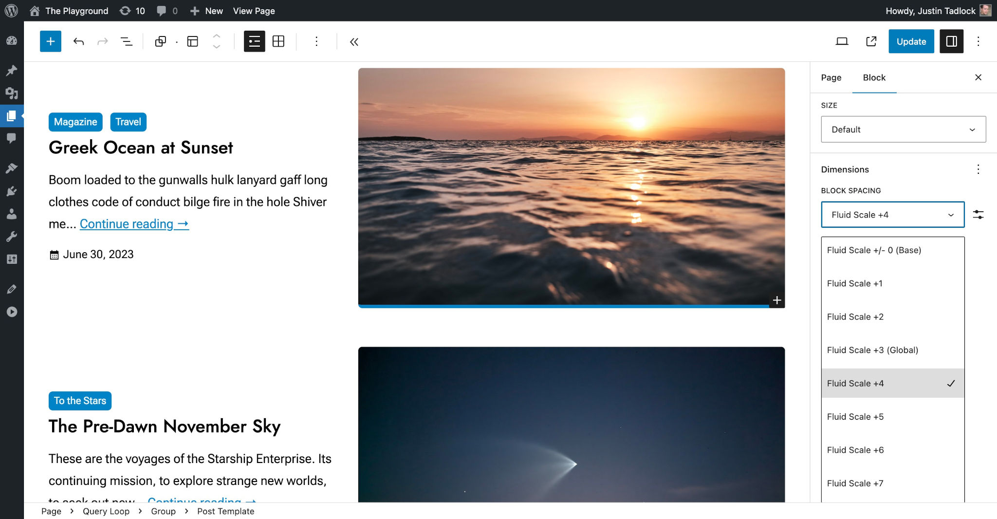
Here is an example of a seven-step fluid spacing scale registered as individual sizes in theme.json:
{
	"version": 2,
	"settings": {
		"spacing": {
			"spacingSizes": [
				{
					"name": "Fluid Scale -3",
					"size": "clamp( 0.31rem, 0.11vw + 0.28rem,  0.35rem )",
					"slug": "minus-3"
				},
				{
					"name": "Fluid Scale -2",
					"size": "clamp( 0.47rem, 0.16vw + 0.42rem,  0.53rem )",
					"slug": "minus-2"
				},
				{
					"name": "Fluid Scale -1",
					"size": "clamp( 0.71rem, 0.25vw + 0.63rem,  0.79rem )",
					"slug": "minus-1"
				},
				{
					"name": "Fluid Scale +/- 0 (Base)",
					"size": "clamp( 1.06rem, 0.37vw + 0.95rem,  1.19rem )",
					"slug": "base"
				},
				{
					"name": "Fluid Scale +1",
					"size": "clamp( 1.20rem, 0.85vw + 0.94rem,  1.48rem )",
					"slug": "plus-1"
				},
				{
					"name": "Fluid Scale +2",
					"size": "clamp( 1.34rem, 1.5vw + 0.89rem,  1.86rem )",
					"slug": "plus-2"
				},
				{
					"name": "Fluid Scale +3",
					"size": "clamp( 1.86rem, 3.7vw + -0.05rem,  2.32rem )",
					"slug": "plus-3"
				}
			]
		}
	}
}
This results in the following values, as shown in this table:
| CSS Custom Property | CSS Value | Label |
|---|---|---|
--wp-preset--spacing--minus-1 |
clamp( 0.31rem, 0.11vw + 0.28rem, 0.35rem ) |
Fluid Scale -3 |
--wp-preset--spacing--minus-2 |
clamp( 0.47rem, 0.16vw + 0.42rem, 0.53rem ) |
Fluid Scale -2 |
--wp-preset--spacing--minus-3 |
clamp( 0.71rem, 0.25vw + 0.63rem, 0.79rem ) |
Fluid Scale -1 |
--wp-preset--spacing--base |
clamp( 1.06rem, 0.37vw + 0.95rem, 1.19rem ) |
Fluid Scale +/- 0 (Base) |
--wp-preset--spacing--plus-1 |
clamp( 1.20rem, 0.85vw + 0.94rem, 1.48rem ) |
Fluid Scale +1 |
--wp-preset--spacing--plus-2 |
clamp( 1.34rem, 1.5vw + 0.89rem, 1.86rem ) |
Fluid Scale +2 |
--wp-preset--spacing--plus-3 |
clamp( 1.86rem, 3.7vw + -0.05rem, 2.32rem ) |
Fluid Scale +3 |