Layout
概述
本文档介绍了 theme.json 中 settings.layout 属性的用途和配置方法,用于定义内容宽度和宽对齐宽度,以控制 WordPress 主题的布局设置。
关键要点
- settings.layout 是一个对象,位于 theme.json 的顶级 settings 属性下,用于存储布局相关设置。
- contentSize 属性定义默认内容宽度,通常用于控制文章内容区域的宽度,建议基于可读性设置(如 45-75 字符每行)。
- wideSize 属性定义宽对齐宽度,允许块突破父容器的内容宽度限制,适用于无侧边栏等设计。
- 在站点编辑器中,可以通过“Inner blocks use content width”选项应用 contentSize 设置,或选择“Wide width”选项应用 wideSize 设置。
代码示例
{
  "version": 2,
  "settings": {
    "layout": {
      "contentSize": "40rem",
      "wideSize": "64rem"
    }
  }
}
注意事项
- contentSize 是基础宽度,块可以通过“wide”或“full”宽度设置突破此限制。
- wideSize 仅在父块启用“Inner blocks use content width”时有用,且不是所有主题都需要设置此值。
- wideSize 应大于 contentSize 但小于全屏宽度(100vw),全屏宽度需使用其他设置。
The settings.layout property in theme.json is an object that stores layout-related settings that you can configure. At the moment, it is used for setting “content” and “wide” widths, but it could also be used for other settings in the future.
In this document, you will learn what the layout property is used for and how you can use it in your theme.
Layout settings
layout is an object that’s nested directly within the top-level settings property in theme.json. Within that object, you can define two settings:
<strong>contentSize</strong>: A valid CSS length value for defining the default width for content. It is typically used for controlling the width of the post content and related areas on the page.wideSize: A valid CSS length value for defining the default wide alignment width, which is generally between the content size and full viewport width.
Take a look at the layout property in the context of a theme.json file with its default values:
{
	"version": 2,
	"settings": {
		"layout": {
			"contentSize": "",
			"wideSize": ""
		}
	}
}
Content size
The settings.layout.contentSize property is primarily useful for defining the width of a site’s content area. Think of this as the default width of your site. You can break outside of this by applying the “wide” (below) or “full” width to a block. The content width is merely the foundation.
In almost any design, you will want to limit this width to something that is comfortable to read, especially if the content is going to include text. This is a value that you will need to determine for yourself, but a good rule of thumb is that you should have 45-75 characters of text per line (though some guidelines differ slightly on the number range). Of course, your default font-family and font-size are crucial pieces to figuring this out.
Try configuring a content size in your theme.json file:
{
	"version": 2,
	"settings": {
		"layout": {
			"contentSize": "40rem"
		}
	}
}
If you open a template in the Site Editor, you can use it to define the layout for various blocks. In the screenshot below, you can see that the Post Content block has the Inner blocks use content width option selected under the Layout tab:
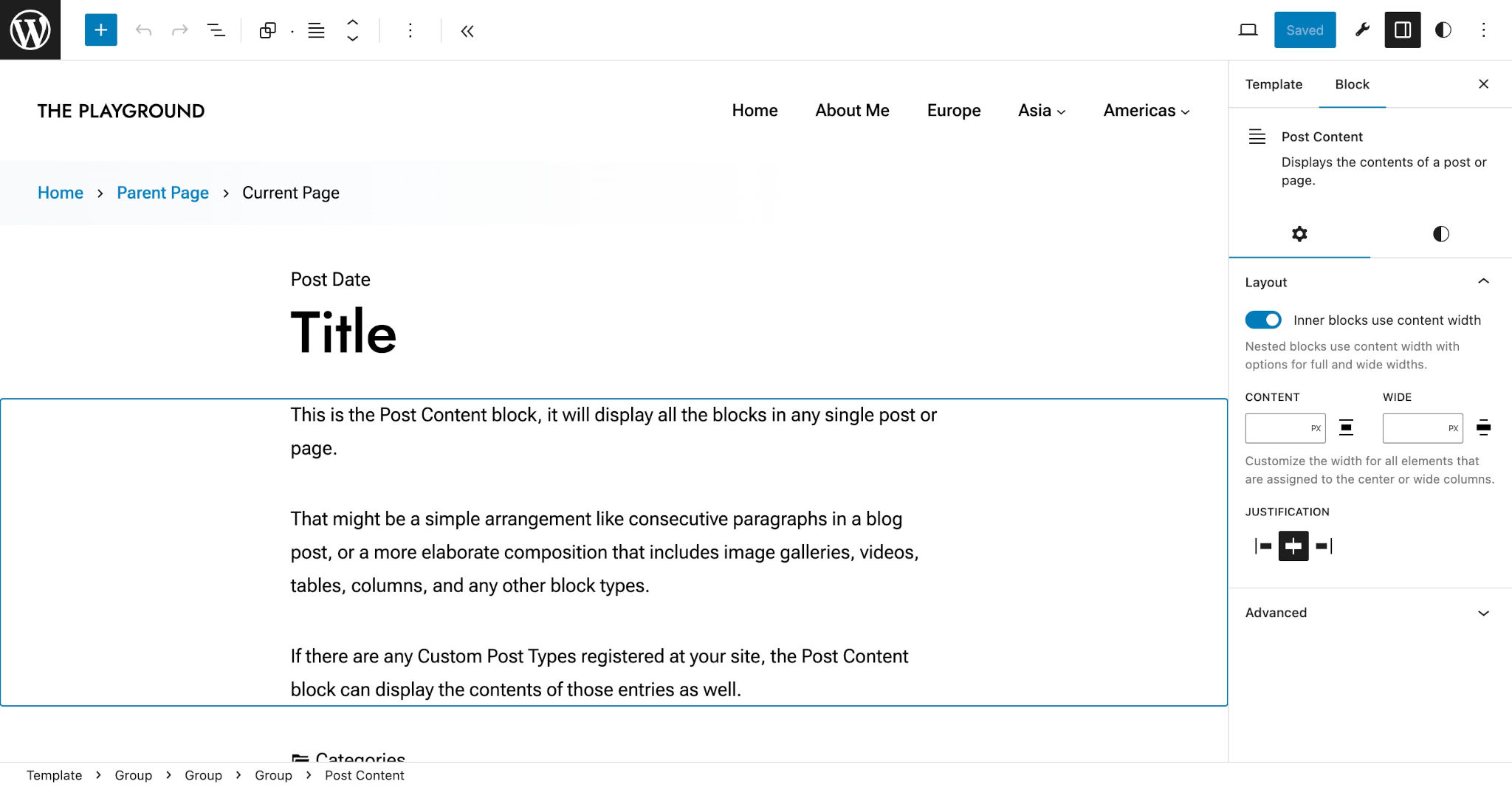
What this setting does is tell WordPress that any nested blocks within the Post Content block should be set to the 40rem value defined for settings.layout.contentSize in theme.json.
Wide Size
The settings.layout.wideSize property defines a width for “wide” blocks. To be useful, wide blocks must be nested within a block that is telling WordPress that its inner blocks should be limited to the “content” size. Wide-aligned blocks are meant to “break outside” of their parent block.
Not every theme will benefit by having a wide size. Depending on the design, a theme’s layout may simply not have additional room for blocks to break out of their container. In those cases, you do not need to set this value.
For theme designs that can accommodate wide blocks (typical of sidebar-less designs), you will want to set this to a value that is greater than settings.layout.contentWidth. But it shouldn’t stretch to the width of the full screen (e.g., 100vw). WordPress has a separate full-width setting that you can use for that.
Try adding a custom settings.layout.wideSize to your theme.json file (remember, you need a set content size for this to be useful):
{
	"version": 2,
	"settings": {
		"layout": {
			"contentSize": "40rem",
			"wideSize": "64rem"
		}
	}
}
Now open your Site Editor in the WordPress admin and edit a template. First, add a Group block with the Inner blocks use content width option enabled. Then, stick another block within it and select the Wide width option.
In the screenshot below, you can see the Post Featured Image block nested within a Group block. It breaks out of its parent container but the other post-related blocks are limited to the content width:
