使用 Interactivity API 构建明暗模式切换按钮
“如何为我的主题构建一个明暗模式切换按钮?”
这是我在区块主题领域从主题作者那里收到的最常见问题之一。甚至还有一个正在进行的 Gutenberg GitHub 工单 请求将其作为一项功能。
但这未必是世界上最简单的问题。如果简单,我们早就为处理明暗配色方案切换制定了标准做法,也就不需要多个插件各自为政了。
幸运的是,浏览器厂商已经为我们做了大量工作,尤其是在过去一年。我们现在就可以使用 CSS 标准来构建符合用户操作系统偏好的 WordPress 主题。这些内容在我之前发表的关于 明暗模式样式 的文章中已有概述。
自从我写了那个初始教程后,我想探索将其提升到新的水平。在现代网页开发中实现明暗配色方案相对容易,但我们能构建一个在它们之间切换的按钮吗?
我将其视为一项个人挑战,要构建一个明暗切换按钮,它需要:
- 不需要自定义区块
- 采用现代 CSS 技术
- 使用标准的 WordPress 钩子和 API
- 最重要的是,可以与任何区块主题捆绑使用
让我带你了解如何使用 WordPress Interactivity API 构建一个现代的明暗切换按钮。
虽然不是必需的,但我强烈建议阅读原始的 掌握明暗模式样式 文章,这是本后续教程的基础。
主题设置
在本教程中,我决定以默认的 Twenty Twenty-Four 主题的子主题为例。我在原始教程中使用了它,因此在此基础上构建是合理的。
首先,在你的 WordPress 安装目录的 wp-content/themes 下创建一个新的 tt4-dark-mode 文件夹。然后,按照以下确切的文件夹结构设置几个空文件:
tt4-dark-mode/
├── functions.php
├── package.json
├── public/
├── resources/
│   ├── js/
│   │   ├── color-scheme.js
│   │   └── editor.js
│   └── scss/
│       └── core-button.scss
├── style.css
├── theme.json
└── webpack.config.js
在跟随本教程的过程中,你将使用到每一个文件。在了解这项技术的工作原理之前,建议不要偏离此结构。
现在在你的 style.css 文件中添加一些基本的 主题文件头字段,以便 WordPress 将其识别为有效主题:
/*!
 * Theme Name:        TT4: Dark Mode
 * Description:       Exploring dark mode with Twenty Twenty-Four.
 * Version:           1.0.0
 * Template:          twentytwentyfour
 * Text Domain:       tt4-dark-mode
 * Tested up to:      6.8
 * Requires at least: 6.6
 * Requires PHP:      8.0
 */
安装 npm 包
本教程需要安装一些 JavaScript 包。首先,将以下代码片段插入你的 package.json 文件,这将添加你稍后将使用的 start 和 build 命令:
{
	"name": "tt4-dark-mode",
	"scripts": {
		"start": "wp-scripts start --webpack-src-dir=resources --output-path=public --experimental-modules",
		"build": "wp-scripts build --webpack-src-dir=resources --output-path=public --experimental-modules"
	}
}
完成后,在计算机上打开命令行应用程序,并导航到你的 wp-content/themes/tt4-dark-mode 目录。首先使用以下命令安装一些开发依赖项:
npm install @wordpress/scripts webpack-remove-empty-scripts --save-dev要深入了解这些脚本的工作原理,请查看主题手册中的 构建过程 文档。
然后安装一些 WordPress 依赖项,稍后你将用于自己的脚本:
npm install @wordpress/blocks @wordpress/i18n @wordpress/interactivity @wordpress/primitives上述步骤并非绝对必要,因为在构建过程中,这些模块的使用会自动转换为 wp JavaScript 全局变量。但这将确保你的 IDE 能够识别它们。
配置 webpack
下一步是配置 webpack 来处理脚本和样式表。我在一篇关于 在主题中使用 WordPress 脚本包 的文章中深入介绍了这个过程。但格式略有变化,因为你将使用 Interactivity API 并创建一个 脚本模块。
将以下代码添加到你的 webpack.config.js 文件中:
const [scriptConfig, moduleConfig] = require('@wordpress/scripts/config/webpack.config');
const RemoveEmptyScriptsPlugin = require('webpack-remove-empty-scripts');
const path = require('path');

module.exports = (() => {
	return [
		{
			// Includes the default webpack config from WordPress.
			...scriptConfig,
			...{
				entry: {
					'js/editor': path.resolve(process.cwd(), 'resources/js', 'editor.js'),
					'css/core-button': path.resolve(process.cwd(), 'resources/scss', 'core-button.scss')
				},
				plugins: [
					...scriptConfig.plugins,
					new RemoveEmptyScriptsPlugin({
						stage: RemoveEmptyScriptsPlugin.STAGE_AFTER_PROCESS_PLUGINS
					})
				]
			}
		},
		{
			// Includes the default webpack config from WordPress.
			...moduleConfig,
			...{
				entry: {
					'js/color-scheme': path.resolve(process.cwd(), 'resources/js', 'color-scheme.js')
				}
			}
		}
	]
})();
现在从计算机的命令行应用程序运行 start 命令:
npm run start添加对用户偏好配色方案的支持
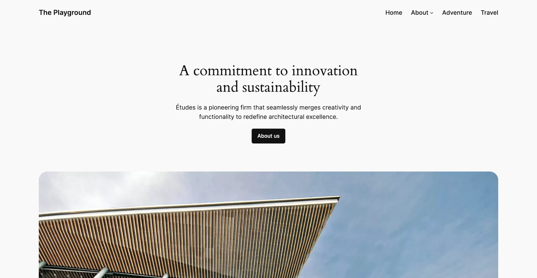
默认情况下,Twenty Twenty-Four 主题有一个浅色配色方案,看起来像这样:
在之前的 明暗模式样式 教程中,我介绍了如何使用 CSS light-dark() 函数和 color-scheme 属性使主题的配色方案遵循用户通过其操作系统定义的偏好。你将在这里做同样的事情。
首先,打开空的 theme.json 文件并添加以下属性:
{
	"$schema": "https://schemas.wp.org/trunk/theme.json",
	"version": 3,
	"settings": {},
	"styles": {}
}
接下来,你将在 settings.color 下定义两个属性。第一个是通过将 settings.color.custom 设置为 false 来禁用自定义颜色。
下一个是使用 CSS light-dark() 函数为每个颜色值定义调色板。light-dark() 接受两个颜色值,第一个是浅色模式下使用的颜色,第二个是深色模式下的颜色。
我已经为这个子主题定义了一个调色板,你可以复制并粘贴到你的 theme.json 文件的 settings 属性上:
"settings": {
	"color": {
		"custom": false,
		"palette": [
			{
				"color": "light-dark(#f9f9f9, #1c1c1c)",
				"name": "Base",
				"slug": "base"
			},
			{
				"color": "light-dark(#ffffff, #111111)",
				"name": "Base / Two",
				"slug": "base-2"
			},
			{
				"color": "light-dark(#111111, #ffffff)",
				"name": "Contrast",
				"slug": "contrast"
			},
			{
				"color": "light-dark(#636363, #888888)",
				"name": "Contrast / Two",
				"slug": "contrast-2"
			},
			{
				"color": "light-dark(#A4A4A4, #3d3d3d)",
				"name": "Contrast / Three",
				"slug": "contrast-3"
			},
			{
				"color": "light-dark(#cfcabe, #60544c)",
				"name": "Accent",
				"slug": "accent"
			},
			{
				"color": "light-dark(#c2a990, #9d7359)",
				"name": "Accent / Two",
				"slug": "accent-2"
			},
			{
				"color": "#d8613c",
				"name": "Accent / Three",
				"slug": "accent-3"
			},
			{
				"color": "light-dark(#b1c5a4, #465a3b)",
				"name": "Accent / Four",
				"slug": "accent-4"
			},
			{
				"color": "light-dark(#b5bdbc, #4d5757)",
				"name": "Accent / Five",
				"slug": "accent-5"
			}
		]
	}
},
你还需要通过将 :root 元素上的 color-scheme 属性设置为 light-dark 来让浏览器知道此主题同时支持浅色和深色模式。通过在 theme.json 的 styles 属性中添加以下 css 字段来实现:
"styles": {
"css": ":root { color-scheme: light dark; }"
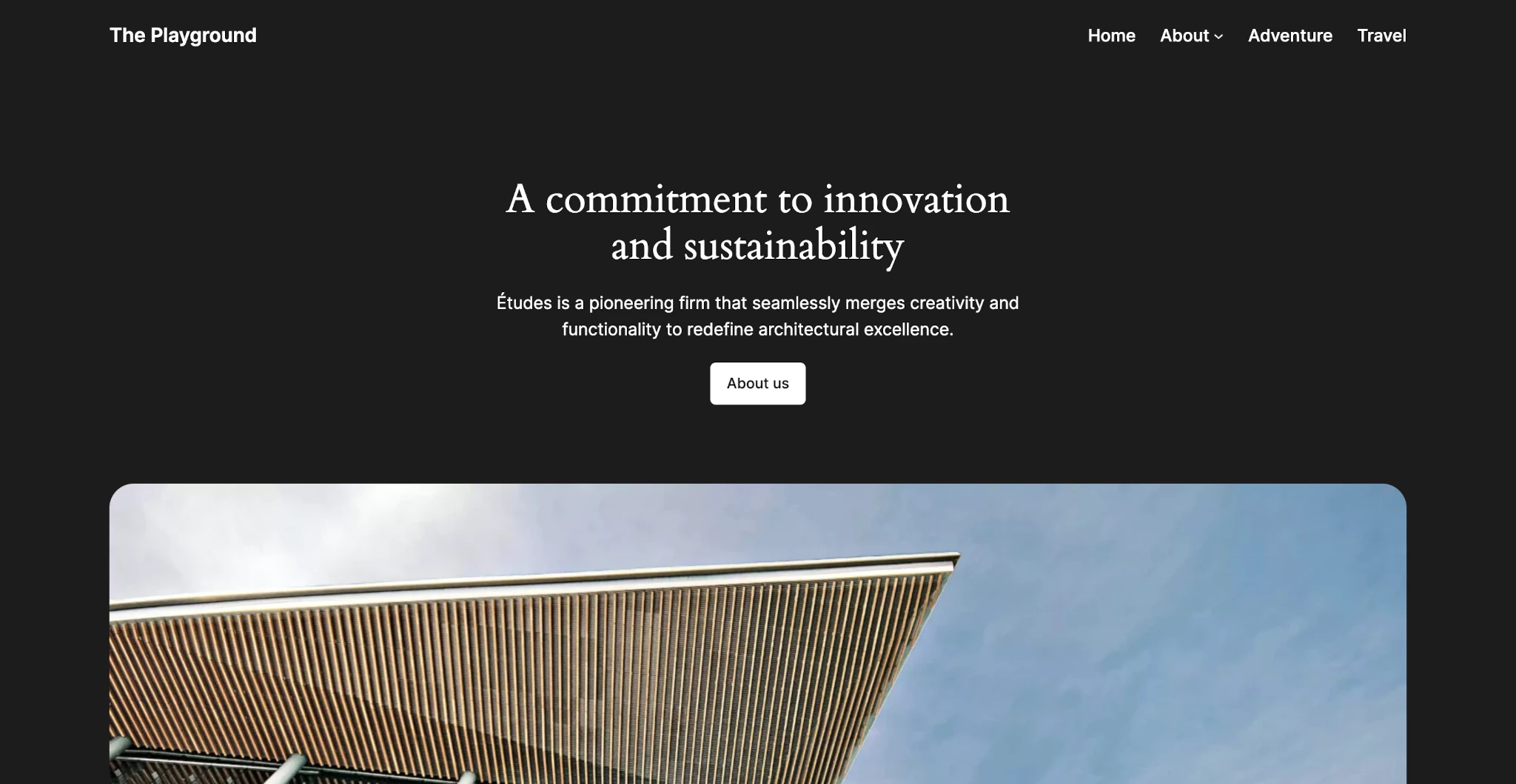
}保存后,你应该可以在操作系统偏好设置中自由切换明暗模式,主题将遵循你的设置。例如,当操作系统设置为深色模式时,主题看起来是这样的:
构建明暗切换按钮
上一节是对我之前教程内容的快速回顾,但它为构建切换按钮提供了必要的基础。毕竟,如果没有定义两种配色方案,你实际上无法在明暗模式之间切换!
在本节中,你将学习如何存储明暗状态、构建切换按钮、为其设置样式,并为其注册区块变体。
开发明暗状态的存储机制
为了使明暗切换有效,你必须有一种方法来存储用户选择的模式。他们可能期望在访问网站上的另一个页面或稍后返回时看到相同的配色方案。
有两种好方法可以做到这一点:
- 用户元数据: 用于在用户拥有帐户并登录时存储状态。
- Cookies: 用于在用户未登录时存储状态。
本教程结合使用了这两种技术,但如果你愿意,也可以选择其中一种。你也可以重写代码以使用 localStorage,但这些数据在服务器上不可用,因此你无法通过 PHP 访问它。
首先要做的是使用 WordPress register_meta() 函数注册一些用户元数据。将此代码添加到你的 functions.php 文件中:
add_action( 'init', 'tt4_dark_mode_register_user_meta' );

function tt4_dark_mode_register_user_meta() {
	$sanitize = fn( $value ) => in_array( $value, ['light', 'dark'], true ) ? $value : '';

	register_meta( 'user', 'tt4-dark-mode-color-scheme', [
		'label'             => __( 'Color Scheme', 'tt4-dark-mode' ),
		'description'       => __( 'Stores the preferred color scheme for the site.', 'tt4-dark-mode' ),
		'default'           => '',
		'sanitize_callback' => $sanitize,
		'show_in_rest'      => true,
		'single'            => true,
		'type'              => 'string'
	] );
}
关于这段代码有几点需要注意:
- 元键是
tt4-dark-mode-color-scheme,你将在下面使用它来访问数据(注意:这也是你将使用的 cookie 名称)。 show_in_rest参数必须为true才能通过 REST API 访问。sanitize_callback函数只接受light和dark值。
让我们构建几个辅助函数来访问明暗状态。第一个是 tt4_dark_mode_get_color_scheme()。它将检查用户元数据(针对登录用户)和 cookie,以确定用户是否有保存的明暗偏好。否则,它返回 light dark,这是主题的默认方案。
function tt4_dark_mode_get_color_scheme() {
	$key = 'tt4-dark-mode-color-scheme';
	$valid_schemes = [ 'light', 'dark' ];

	if ( is_user_logged_in() ) {
		$scheme = get_user_meta( get_current_user_id(), $key, true );

		if ( $scheme && in_array( $scheme, $valid_schemes, true ) ) {
			return $scheme;
		}
	}

	if ( isset( $_COOKIE[ $key ] ) ) {
		$scheme = sanitize_key( wp_unslash( $_COOKIE[ $key ] ) );

		if ( $scheme && in_array( $scheme, $valid_schemes, true ) ) {
			return $scheme;
		}
	}

	return 'light dark';
}
接下来,创建一个简单的条件函数 tt4_dark_mode_is_dark_scheme()。此函数确定当前配色方案是否为深色。如果无法确定方案,则返回 null。
function tt4_dark_mode_is_dark_scheme() {
	$scheme = tt4_dark_mode_get_color_scheme();

	return match( $scheme ) {
		'dark'   => true,
		'light'  => false,
		default  => null
	};
}
创建切换按钮
此过程的下一阶段是构建一个可以通过 Interactivity API 切换的实际按钮。为此,你首先需要向 WordPress 按钮区块添加 interactivity 支持。
add_filter( 'block_type_metadata_settings', 'tt4_dark_mode_block_type_metadata_settings' );

function tt4_dark_mode_block_type_metadata_settings(array $settings) {
	if ( 'core/button' === $settings['name'] ) {
		$settings['supports']['interactivity'] = true;
	}

	return $settings;
}
整个教程的真正诀窍就在接下来的这一刻。
如果你不知道,WordPress 允许你为其按钮区块使用 <button> 元素,而不是默认的链接元素,前提是你通过代码编辑器模式进行。这是两年前通过拉取请求添加的。它并不完全可见,因为 UI 中从未添加过 HTML 元素选择器(将在 WordPress 6.9 中到来)。
无论如何,你可以使用它来创建实际的 <button> 标签,这意味着在 WordPress 区块主题中创建交互功能的世界充满了可能性。在本例中,就是一个交互式的明暗切换按钮!
接下来,你将过滤按钮区块以执行四件事:
- 确定它是否具有
toggle-color-scheme类和一个内部的<button>元素。 - 向
<button>添加一些交互指令,这些是通过 Interactivity API 添加行为的 HTML 属性。这让你可以管理状态、副作用、事件等。 - 通过
wp_interactivity_state()设置初始交互状态,将必要的数据传递给你将在下一节构建的脚本。 - 加载你稍后将用于处理交互性的脚本。
大部分工作都是使用 WP_HTML_Tag_Processor 类完成的,这使得修改 HTML 的过程变得轻而易举。
add_filter( 'render_block_core/button', 'tt4_dark_mode_render_button', 10, 2 );

function tt4_dark_mode_render_button( string $content, array $block ) {
	$processor = new WP_HTML_Tag_Processor( $content );

	// Determine if this is a light/dark toggle button.
	if (
		! $processor->next_tag( [