构建具有“悬停显示”效果的卡片布局
可点击卡片是一种常见的交互组件。创建它们时需要考虑很多事情,很大程度上取决于它们被放置的上下文。今天,你将学习如何使用 Grid 块创建它们,并添加一些基于 CSS 的动画来增强最终效果。
以下是你要采取的一般步骤:
- 使用 Grid 块和嵌套的内部块创建布局。
- 注册一个新的块样式以扩大可点击区域。
- 通过更多自定义样式为嵌套元素添加动画。
- 将块布局保存为 Pattern。
如果你想在阅读时尝试最终的模式甚至插件,这里是 Grid Cards 模式 和 hover-reveal-effect 插件。
使用 Grid 块创建卡片布局
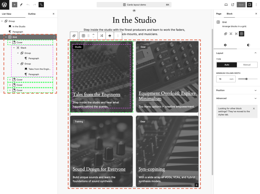
首先,你将使用块构建卡片布局和外观。我最终使用了以下块:
- 一个启用了 Auto 布局类型的 Grid 块。此外,你可能需要考虑将 Advanced > HTML Element 设置为
<section>。- 一个应用了图像和叠加层的 Cover 块。此外,你可能需要考虑将 Advanced > HTML Element 设置为
<article>。这取决于你打算如何使用最终的模式。不同的 HTML 语义可以在不同的上下文中应用。- 一个最小高度为
22rem且垂直对齐类型设置为 Space between 的 Stack 块。这些块代表我们的卡片。- 一个包含嵌套 Paragraph 块 的 Group 块,代表我们卡片的标签。
- 另一个由嵌套的带链接的 Heading 和作为简短摘要的 Paragraph 块 组成的 Group 块。
- 一个最小高度为
- 一个应用了图像和叠加层的 Cover 块。此外,你可能需要考虑将 Advanced > HTML Element 设置为
以下是构成最终 Grid Cards 模式 的块的截图:
你可以尝试不同的间距、颜色和排版,使内部块与你的整体设计美学相匹配。
额外提示:列表视图中的块重命名
考虑在列表视图中重命名关键块。这是增强编辑体验的一个好方法,可以帮助阐明每个卡片中嵌套元素代表什么。一旦你确定了整体的块配置并希望将其保存为模式,那么名称也会被保存。
这里有一张截图,展示了如何重命名你的卡片块。
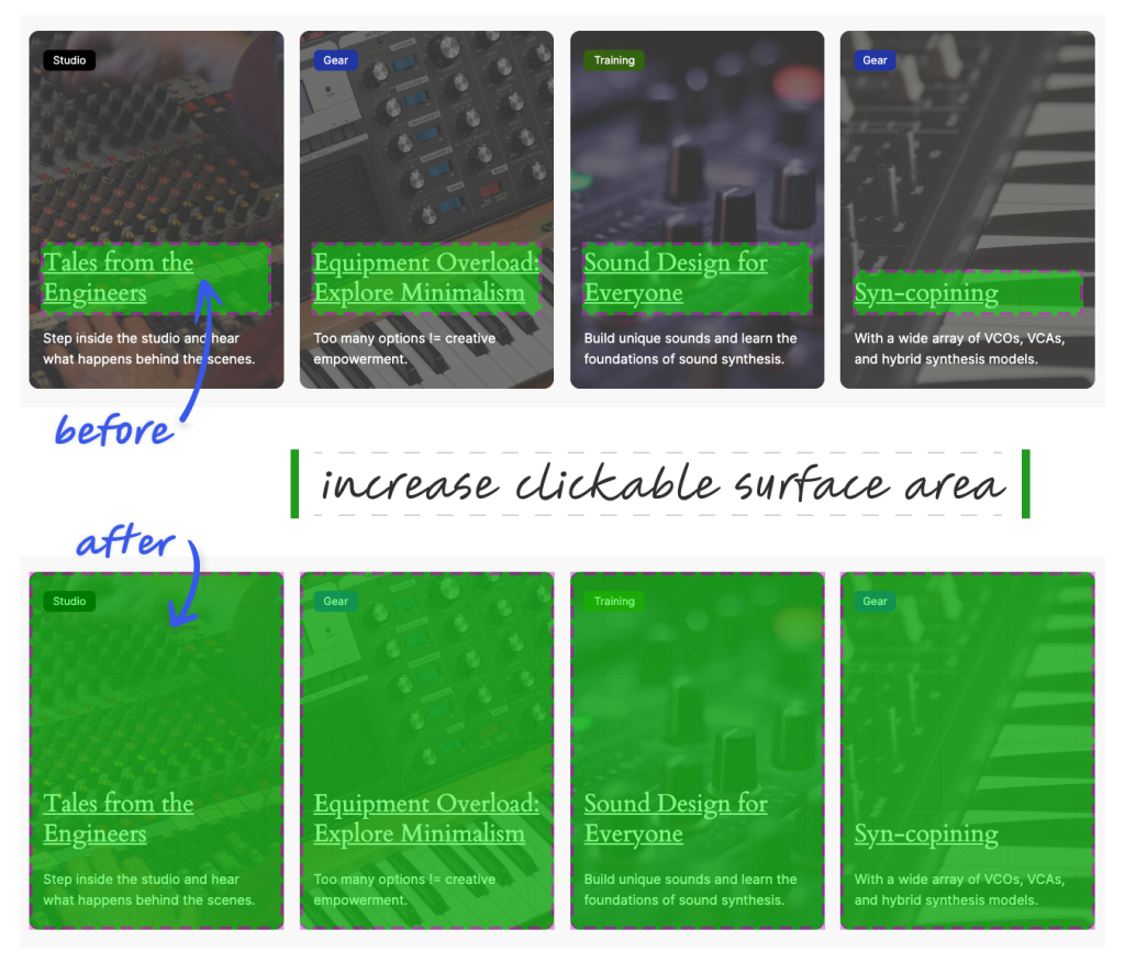
增加可点击区域
你可能已经注意到只有 Heading 块是可点击的。然而,你网站的访问者——尤其是在移动设备上浏览的访问者——可能会喜欢更大的可点击区域。
为可点击卡片注册块样式
WordPress 没有提供创建此类交互的原生方法。要实现这一点,你需要注册一个块样式并添加自定义 CSS。将以下代码添加到你主题的 functions.php:
add_action( 'init', 'themeslug_register_block_styles' );

function themeslug_register_block_styles() {
   register_block_style(
       'core/cover',
       array(
           'name'         => 'card--interactive',
           'label'        => __( 'Card (Interactive)', 'themeslug' ),
           'inline_style' => '
               .is-style-card--interactive {
                   position: relative;
               }
               .is-style-card--interactive :where(.wp-block-group.wp-block-group-is-layout-constrained) {
                   position: static;
               }
               .is-style-card--interactive :where(.wp-block-heading) a:after {
                   content: "";
                   inset: 0;
                   position: absolute;
                   z-index: 10;
               }
           ',
       )
   );
}
该代码通过自定义 CSS 定位 Cover 块,并期望有一个包含链接的嵌套 Heading 块。
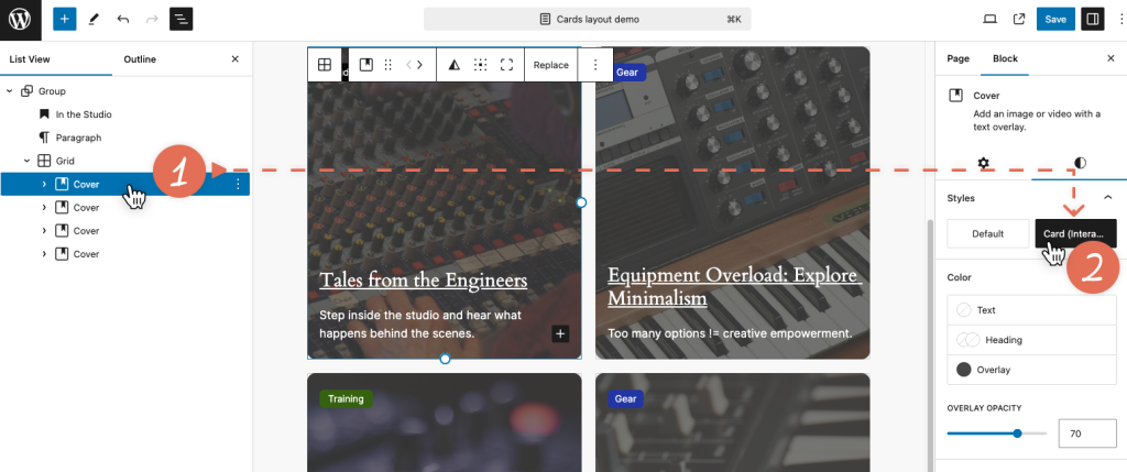
回到编辑器,点击每个 Cover 块,分配“Cards (Interactive)”样式,并验证整个卡片是否可点击。
如果你对结果满意,可以就此打住,享受这个完全可点击的卡片。或者,你可以通过为内部块添加一些动画来增加一点趣味。
为标签和摘要添加动画
微妙的动画可以带来愉悦的体验。你可以通过一些 CSS 样式扩展你的自定义“Card (Interactive)”块。
为了保持条理,让我们将样式移到一个单独的文件中,并更新 functions.php 文件:
- 在你的主题中创建一个新文件:
assets/css/blocks/core/cover–card-interactive.css。 - 更新
register_block_style()函数并排队加载这个新的样式表。不使用inline_style属性,而是切换到style_handle属性,并传递一个调用外部样式表的已注册句柄。
用以下代码替换之前的代码:
add_action( 'init', 'themeslug_enqueue_block_styles' );

function themeslug_enqueue_block_styles() {
   wp_enqueue_block_style(
       'core/cover',
       array(
           'handle' => 'themeslug--card-interactive',
           'src'    => get_theme_file_uri( 'assets/css/blocks/core/cover-card-interactive.css' ),
           'path'   => get_theme_file_path( 'assets/css/blocks/core/cover-card-interactive.css' ),
       )
   );
}

add_action( 'init', 'themeslug_register_block_styles' );

function themeslug_register_block_styles() {
   register_block_style(
       'core/cover',
       array(
           'name'         => 'card--interactive',
           'label'        => __( 'Card (Interactive)', 'themeslug' ),
           'style_handle' => 'themeslug--card-interactive',
       )
   );
}
将以下 CSS 复制到你的 cover-card-interactive.css 文件中。你可以根据喜好调整动画:
.is-style-card--interactive {
   box-shadow: 0 1px 1px rgba(0, 0, 0, 0.1), 0 2px 2px rgba(0, 0, 0, 0.1), 0 4px 4px rgba(0, 0, 0, 0.1), 0 8px 8px rgba(0, 0, 0, 0.1), 0 16px 16px rgba(0, 0, 0, 0.1);
   position: relative;
   transition: box-shadow 0.5s ease;
}

.is-style-card--interactive:focus-within,
.is-style-card--interactive:hover {
   box-shadow: 0 1px 1px rgba(0, 0, 0, 0.2), 0 2px 2px rgba(0, 0, 0, 0.2), 0 4px 4px rgba(0, 0, 0, 0.2), 0 8px 8px rgba(0, 0, 0, 0.2), 0 16px 16px rgba(0, 0, 0, 0.2);
}

.is-style-card--interactive :where(.wp-block-group.wp-block-group-is-layout-constrained) {
   position: static;
}

/* 使整个卡片可点击 */
.is-style-card--interactive:not(.has-child-selected) :where(.wp-block-heading) a:after {
   content: "";
   inset: 0;
   position: absolute;
   z-index: 10;
}

/* 为 Cover 块图像添加动画 */
.is-style-card--interactive :where(.wp-block-cover__image-background) {
   filter: saturate(100%) brightness(100%);
   transform: scale(1);
   transition: all 0.35s ease;
}

.is-style-card--interactive:not(.has-child-selected):focus-within :where(.wp-block-cover__image-background),
.is-style-card--interactive:not(.has-child-selected):hover :where(.wp-block-cover__image-background) {
   filter: saturate(200%) brightness(40%);
   transform: scale(1.15);
}

/* 为标签区域添加动画 */
.is-style-card--interactive :where(.is-vertical) .wp-block-group:first-of-type {
   opacity: 0;
   transform: scale(0.95) translateX(-1rem);
   transform-origin: center right;
   transition: all 0.25s ease-in-out;
   transition-delay: 0.2s;
}

.is-style-card--interactive:focus-within :where(.is-vertical) .wp-block-group:first-of-type,
.is-style-card--interactive:hover :where(.is-vertical) .wp-block-group:first-of-type {
   opacity: 1;
   transform: scale(1) translateX(0);
}

/* 为内容区域添加动画 */
.is-style-card--interactive:not(.has-child-selected) :where(.is-vertical) .wp-block-group:first-of-type + .wp-block-group p {
   max-height: 0;
   opacity: 0;
   overflow: hidden;
   transition: max-height 0.35s cubic-bezier(.19,1,.22,1), opacity 0.6s ease;
}

.is-style-card--interactive:focus-within :where(.is-vertical) .wp-block-group:first-of-type + .wp-block-group p,
.is-style-card--interactive:hover :where(.is-vertical) .wp-block-group:first-of-type + .wp-block-group p {
   max-height: 100%;
   opacity: 1;
}

.is-style-card--interactive :where(.is-vertical) {
   display: flex;
}

@media (prefers-reduced-motion: reduce) {
   .is-style-card--interactive *,
   .is-style-card--interactive *::after,
   .is-style-card--interactive *::before {
       opacity: 1 !important;
       transition: none !important;
       visibility: visible !important;
   }
}
总结
通过一点规划和思考,你可以逐步增强网站的交互性,并为访问者提升整体体验。
你可以在 这个 GitHub 仓库中找到完整的插件代码。欢迎你 fork 它,自定义它,并在下面的评论中分享你在项目中的使用方式。